one of our smallest projects (to date) gets a spread in the feb / mar issue of gray magazine.

see more about the project here.
one of our smallest projects (to date) gets a spread in the feb / mar issue of gray magazine.

see more about the project here.
We're excited to share some new photos of the Oceanside Beach House. On a recent sunny fall day, Portland photographer David Papazian made the trip to Oceanside to shoot a handful of images. We think they turned out quite well. Let us know if you agree.
the rare sunny portland winter day has allowed us to regale in the golden rays.
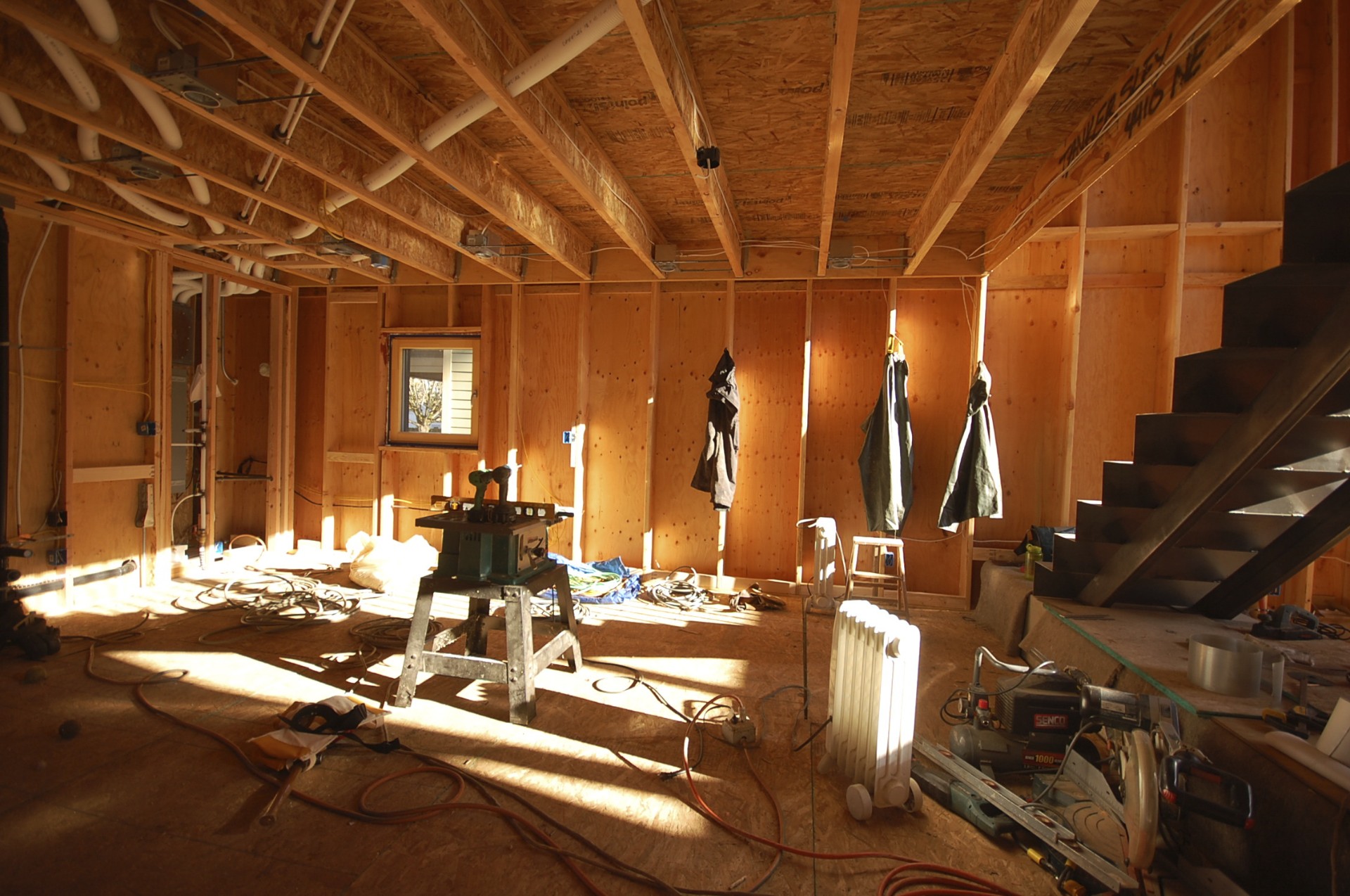
glorious sun reaches all the way to the back of the kitchen.
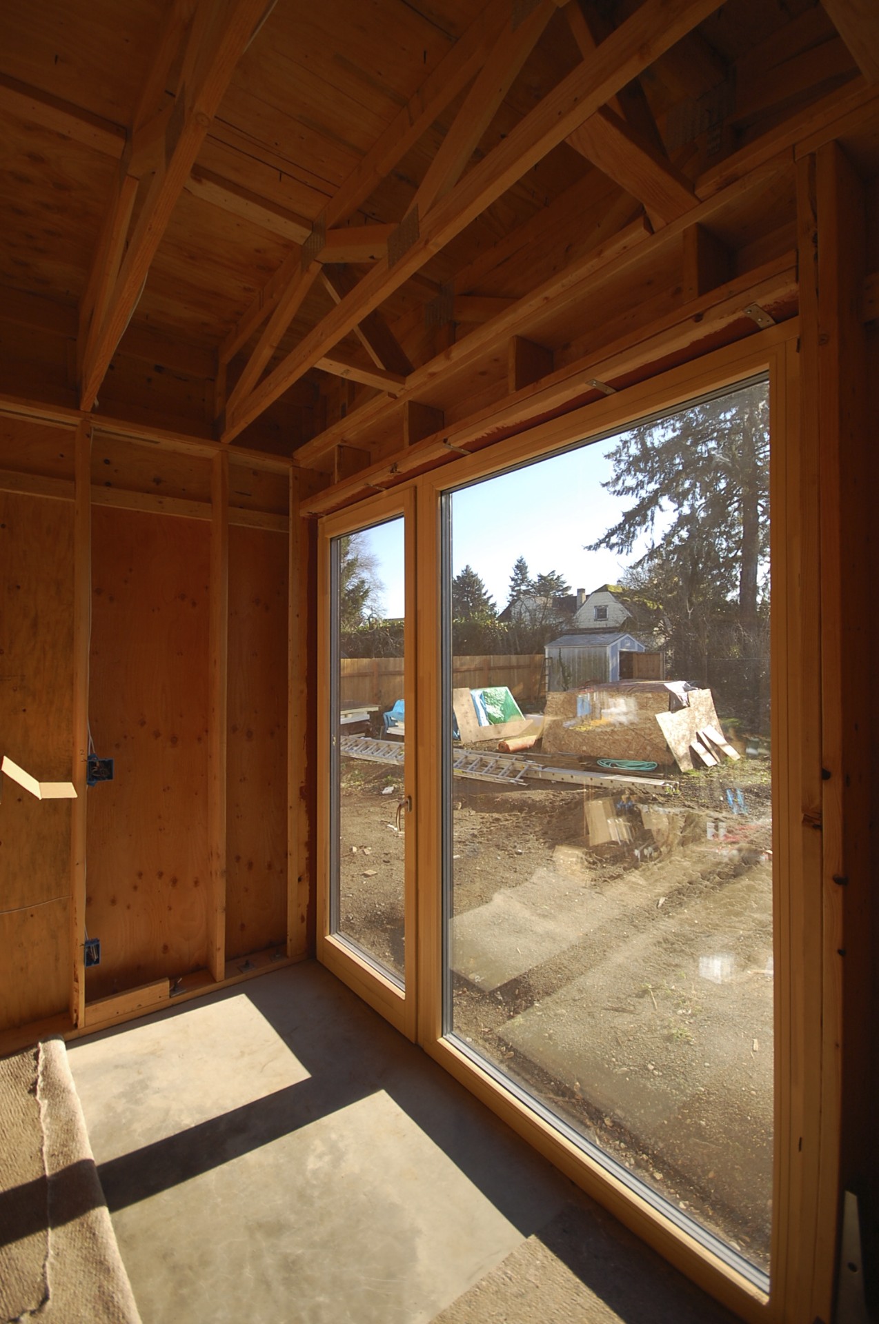
the south facing windows / heaters are working.
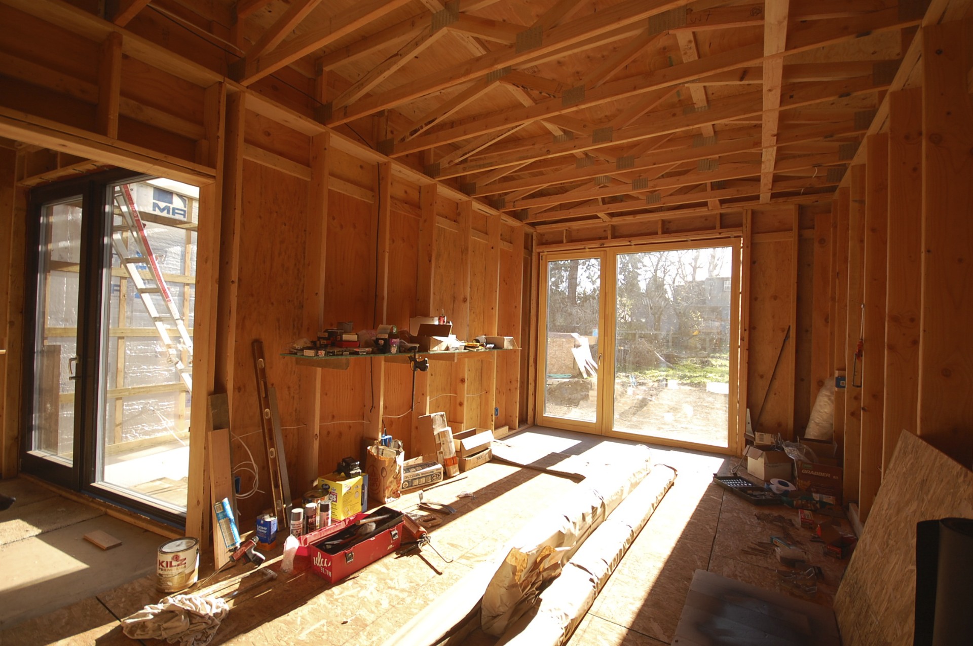
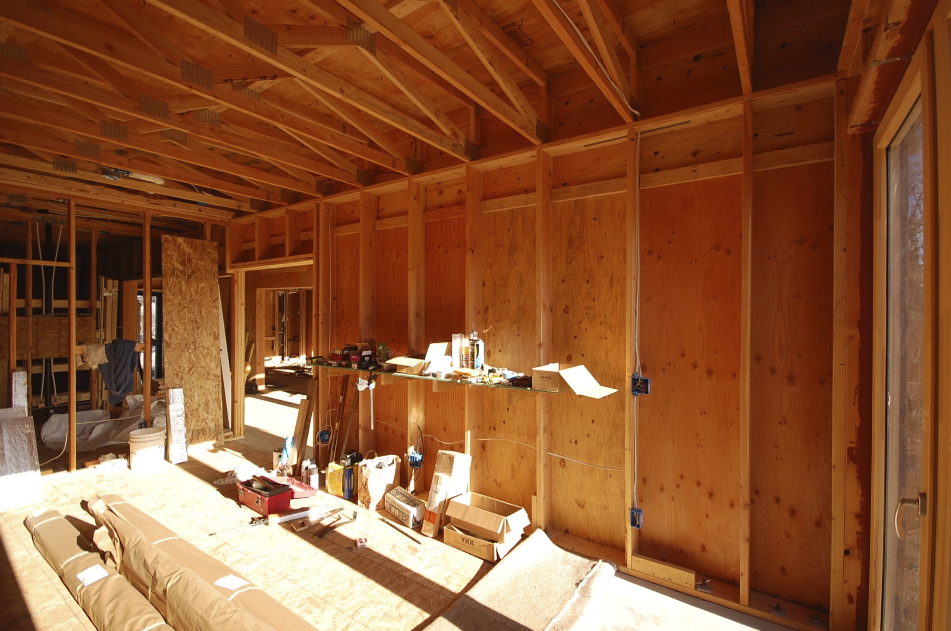
the studio flooded in mid-day sun.
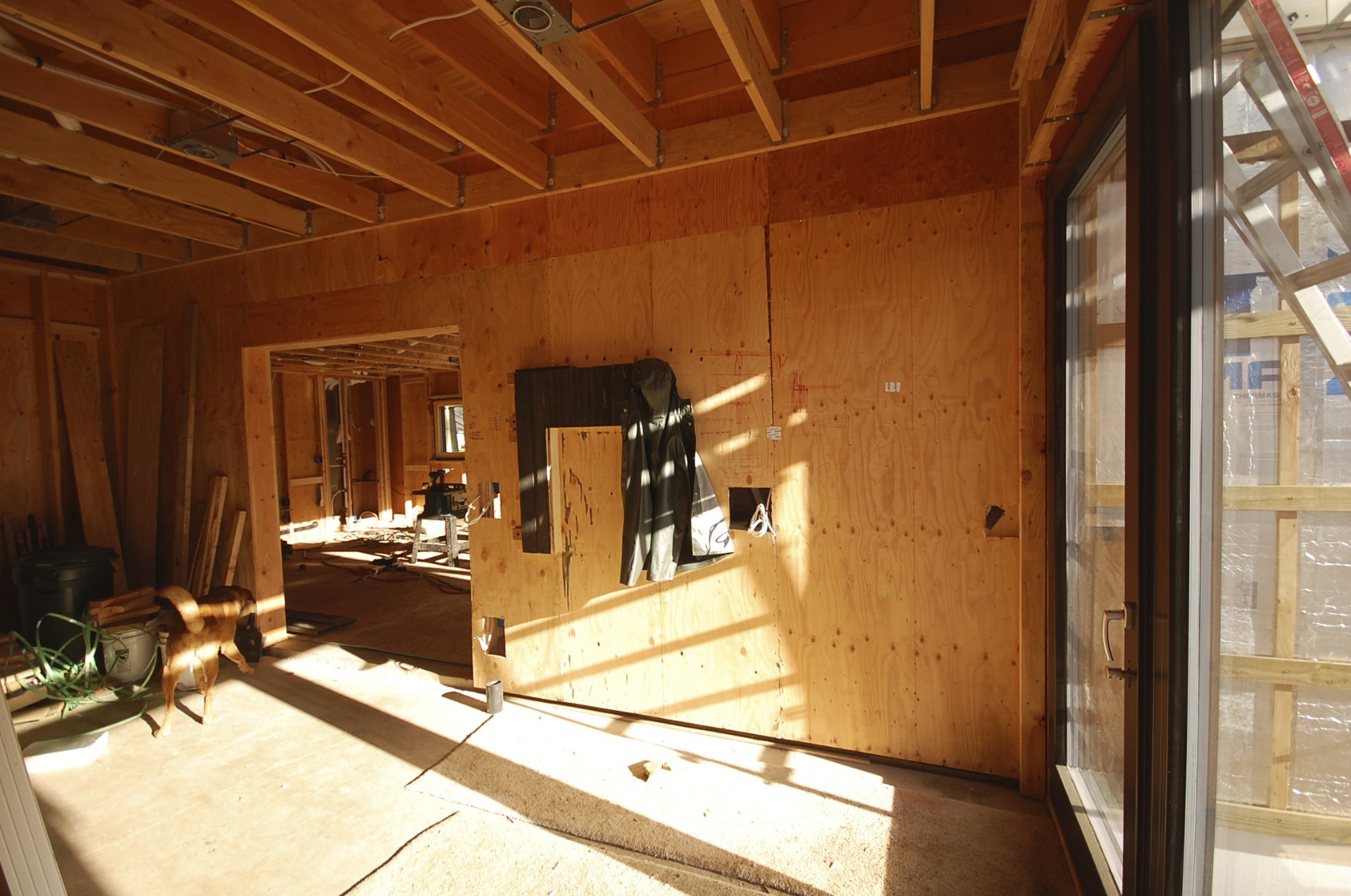
the breezeway will be a study in light and dark.
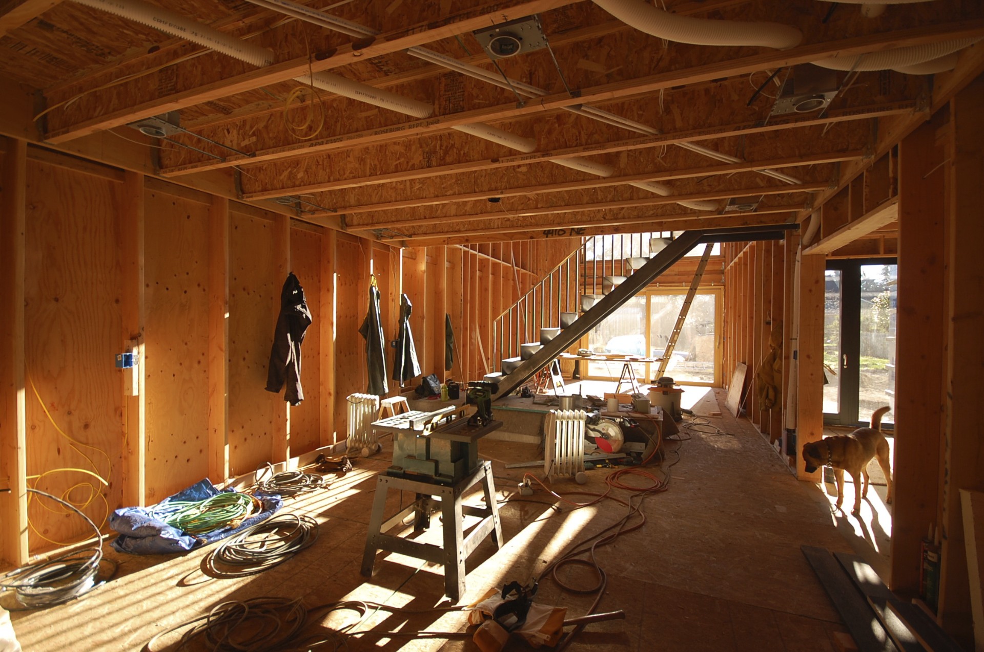
rejoice.
in addition to direct gain, we will have a small PV system on the roof. more on that later.
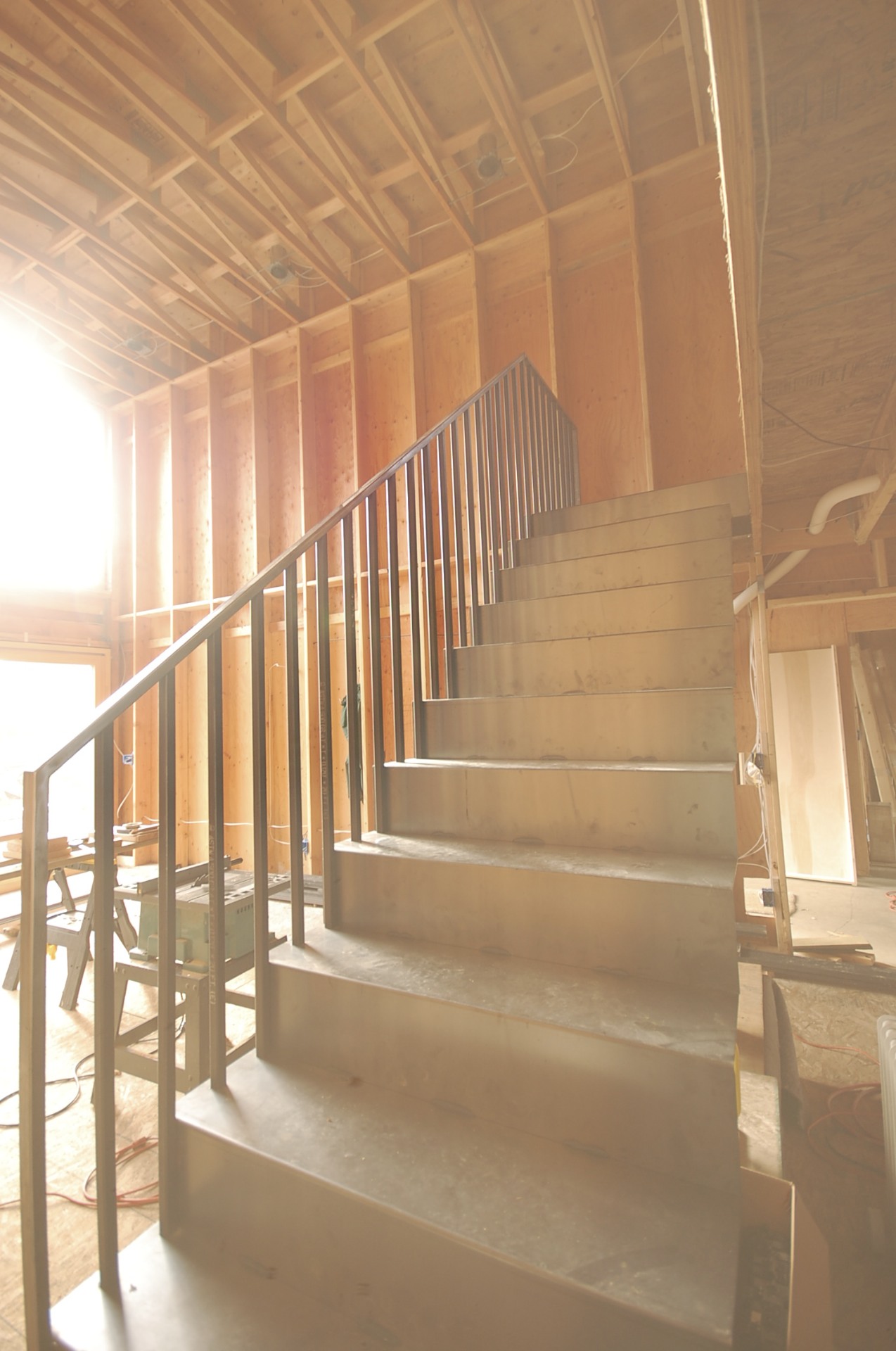
while most of the attention has been focused on the insulation, windows and air sealing, the interior stair has made slow but steady progress.
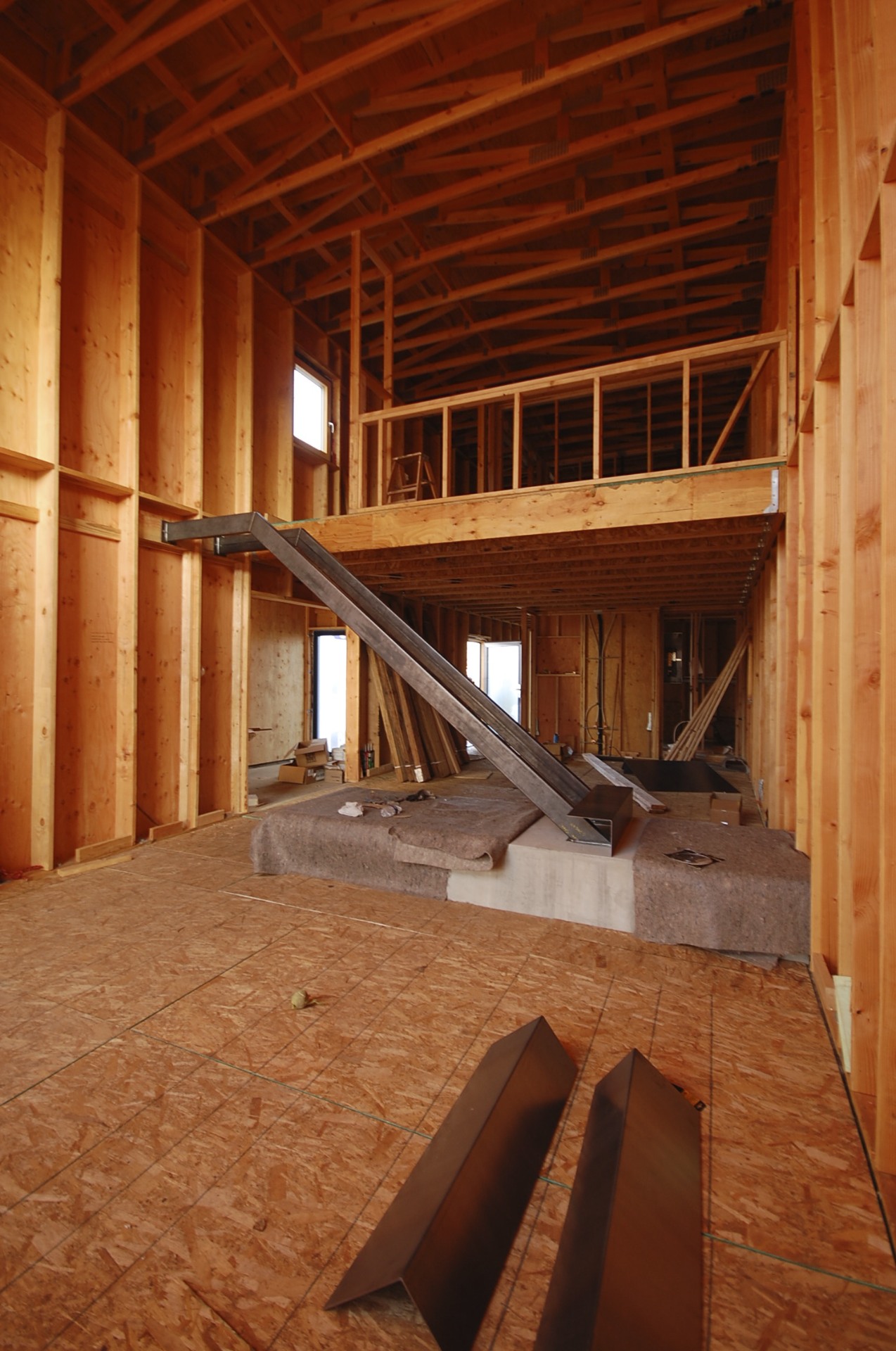
stringers are tube steel bolted to concrete landing and wood wall
tread risers are 1/8" thick bent plate steel
everything is fit up and welded in place
guardrail is 1" sq tube steel verticals
steel will be left natural with all the signs of fabrication exposed
a clear coat will be applied at completion
still more to go but we think it's coming along nicely.
thanks to alameda metal works for their fine work.
we made a quick visit to oceanside to check in on the construction progress over the last few months. the owners are doing most of the work themselves, and they've been moving along steadily on the interior. the spaces are starting to take shape, colors are getting introduced, and this little beach house is starting to come to life.
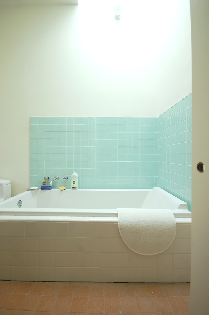
we recently shared some drawings and photos of a small bathroom remodel inspired by the japanese bath house. the work is complete and it turned out quite nicely (thanks to right arm construction). here are some photos of the completed project:

a quick reminder of what it once was.
as we mentioned in our last small project update, we are working on another remodel of an existing bathroom. although these projects are not huge and flashy, our client is awesome and we love this little project. it definitely challenges the notion of what a bathroom can be.

inspired by the japanese bath house, a new skin of wood wraps the entire room. a wall to wall skylight is inserted over the shower to flood the room with daylight. to minimize costs, the existing framing and fixture layout was retained.
the existing ceiling was cut back from the shower wall and a sloped well was framed up to the new skylight. we projected the ceiling into the well just enough to position a new concealed fluorescent uplight to add some evening drama. to avoid any structural impact and keep things simple and raw, we allowed the existing rafters to run through the well exposed.
the wood is reclaimed douglas fir that was salvaged from an old willamette river dock and milled by creative woodworking.
right arm construction is the general contractor, and is doing a beautiful job. check back soon for images of the finished project.
we recently completed work on a small bathroom remodel with some pleasing results.

the existing dropped sheetrock ceiling was removed to expose the original wood decking. a carbonized bamboo cabinet provides a nice complement to the wood ceiling.
the existing shower compartment was replaced with a curbless all glass shower surround outfitted with a linear slot drain.
a duravit wall hung dual flush toilet is mounted on a background of simple white 3x6 tile in a stacked bond pattern.
a linear glass tile backsplash above the white quart countertop provides a hint of color. trimless mirrored doors conceal a wall to wall medicine cabinet.
linear porcelain tile provides a beautiful cost effective floor. a perimeter soffit conceals new piping and accommodates uplighting.
another bathroom remodel project is in the works. check back soon for the next small project update.
Just after the first WW, Enrnst May, Frankfurt's city architect initiated an ambitious project to house millions of soldiers returning to Germany, as well as thousands of war widows. May brought into his office a young but experienced Viennese architect, Grete Schütte-Lihotzky, to design a modern, rational, work kitchen.
frankfurt kitchen | 1927 | grete schütte-lihotzky
The kitchen's organizing principle is similar to that of the design of galleys in ships and trains of the era. Its tiny size reflected a desire for efficiency and to save room for the living spaces of the flat.
frankfurt kitchen | 1927 | grete schütte-lihotzky
The kitchen's innovative features included continuous work surfaces, a table for preparing food under a large window, storage bins with handles and spouts, an adjustable ceiling light, a movable stool, a concealed pass-through, drop-down ironing board, and cabinetry painted a deep blue to naturally repel flies.
frankfurt kitchen reconstruction | 1990 | MAK vienna
Lihotsky apparently drew endless diagrams of how cooks move in a kitchen to understand how to maximize efficiency. The surfaces are at sitting height, so the cook didn't have to be on her feet the whole time.
frankfurt kitchen reconstruction | 2006 | v+a museum
Probably the biggest innovation was to take the dining table out of the kitchen. This simple galley working kitchen satisfied the modernists' concern with hygiene and made for a more efficient floorplan.
frankfurt kitchen reconstruction | 2006 | v+a museum
Not only was the layout of the kitchen innovative, but so was its construction and affordability. The cabinets were made without sides and backs to save cost, and special loans were made available to allow residents to buy a kitchen and pay it off with the monthly rent.
aluminum drawer detail
Over 10,000 versions of the frankfurt kitchen were installed within a four-year period. This small efficient kitchen became a standard in Europe throughout the 20th century.
in situ prior to dismantle and reconstruction
[youtube=http://www.youtube.com/watch?v=cbV5tUWhpGg]
thanks patrick
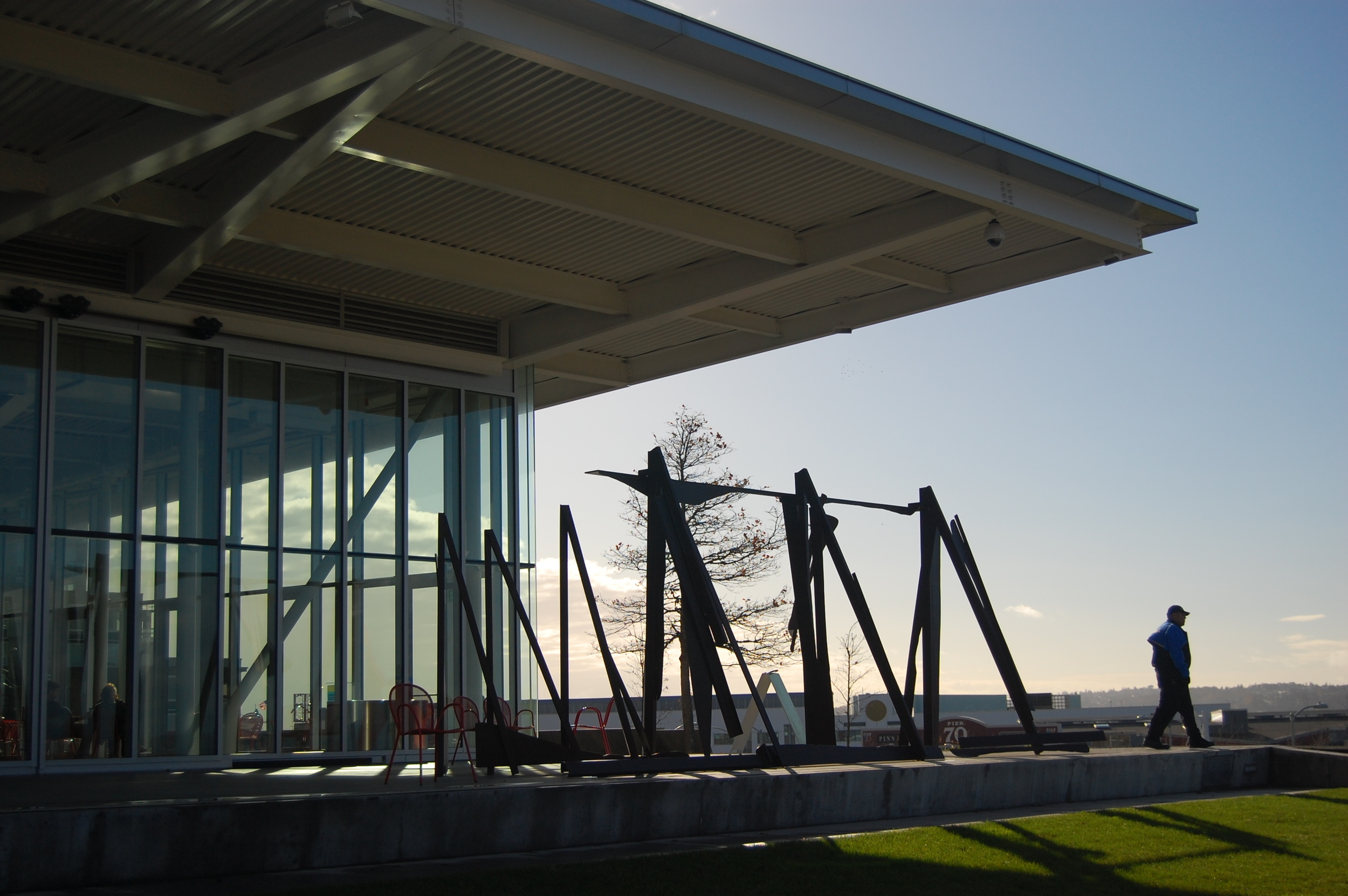 olympic sculpture park | pavilion terrace with anthony caro
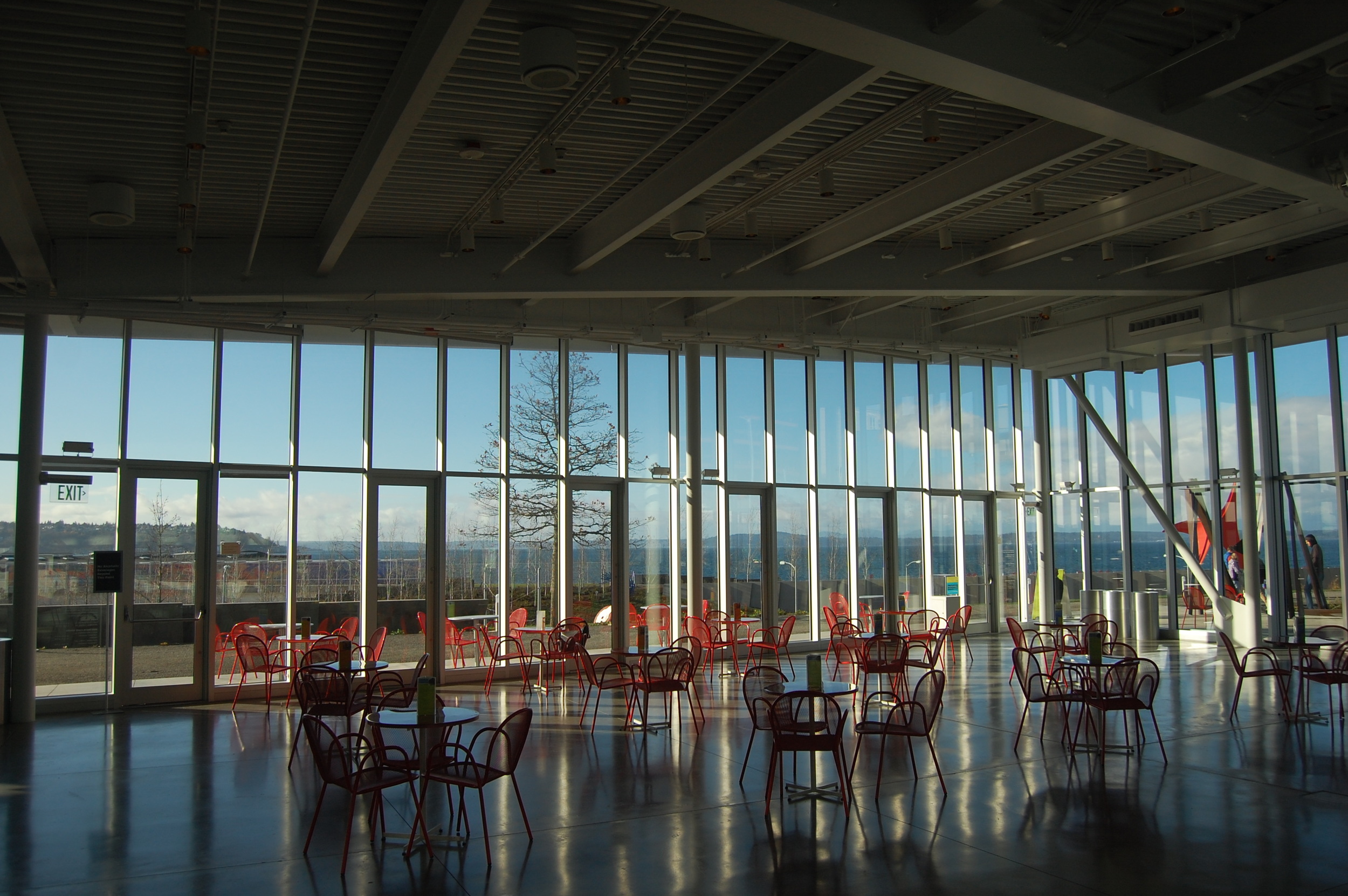
olympic sculpture park | pavilion interior
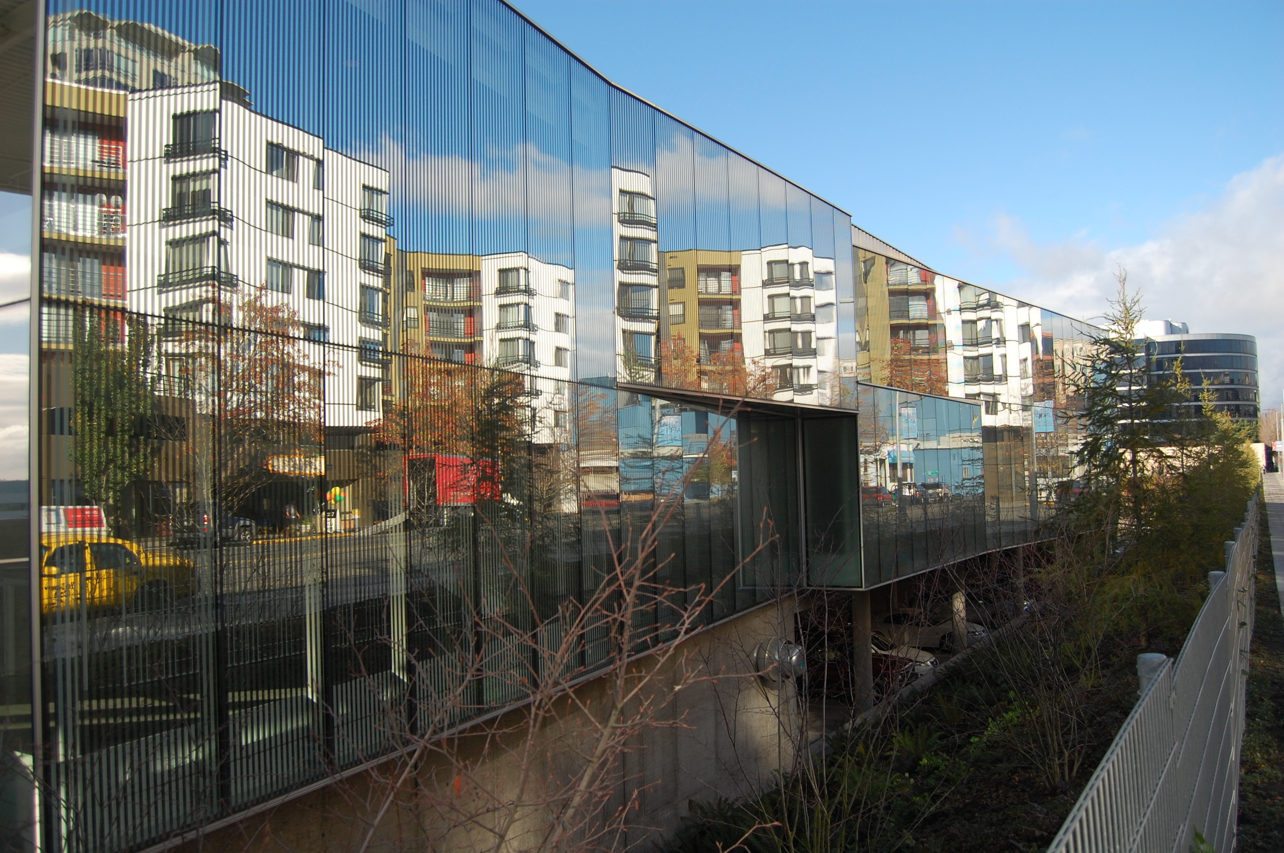
olympic sculpture park | western avenue reflection
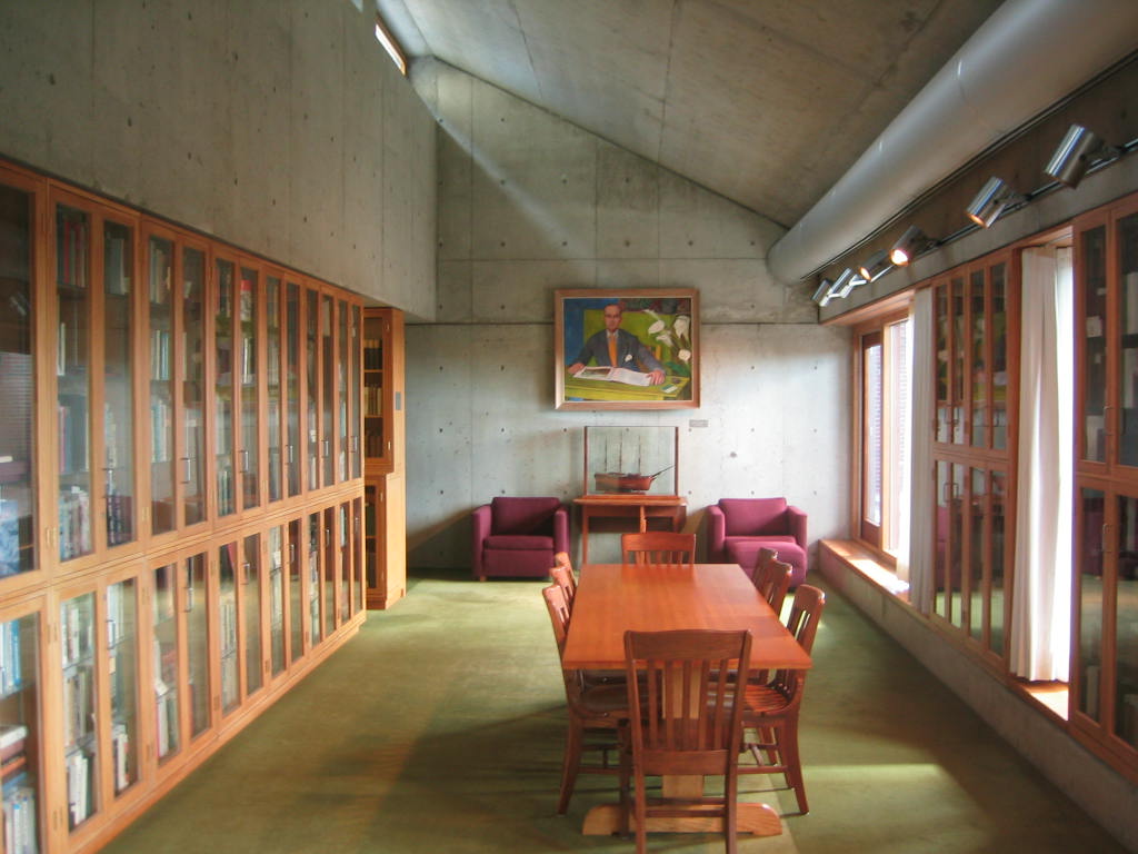 meeting room at exeter library by l. kahn
 magnesium bathroom by RM Schindler