beach house interior
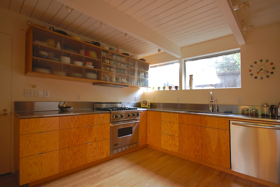
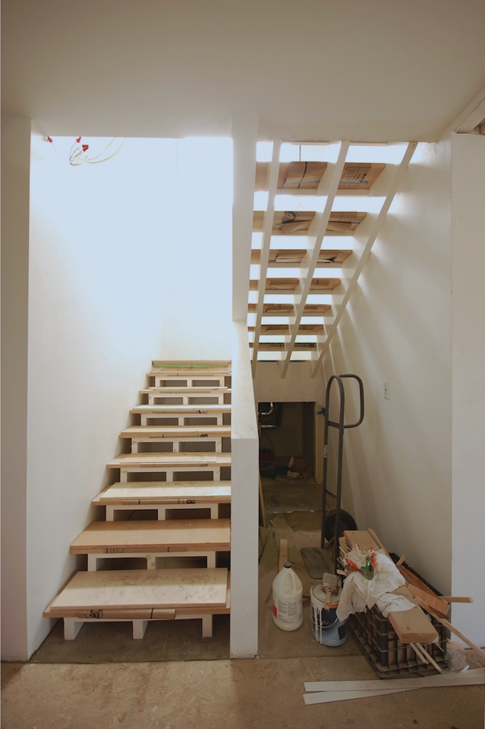
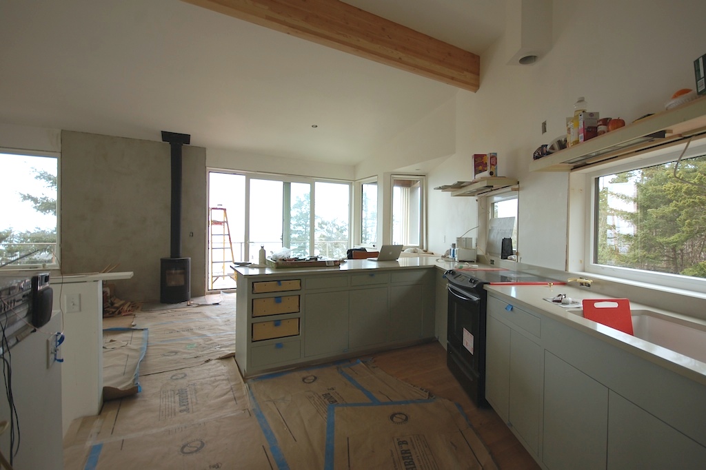
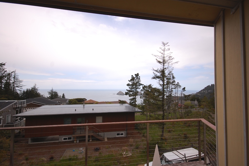
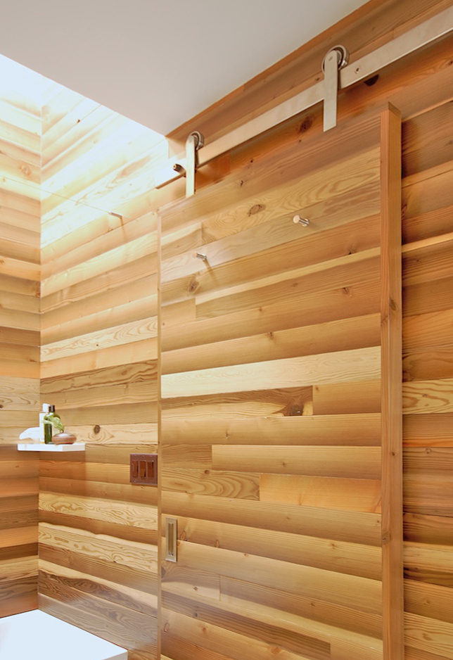
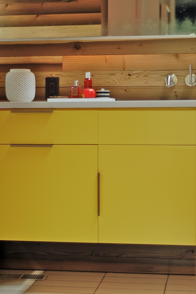
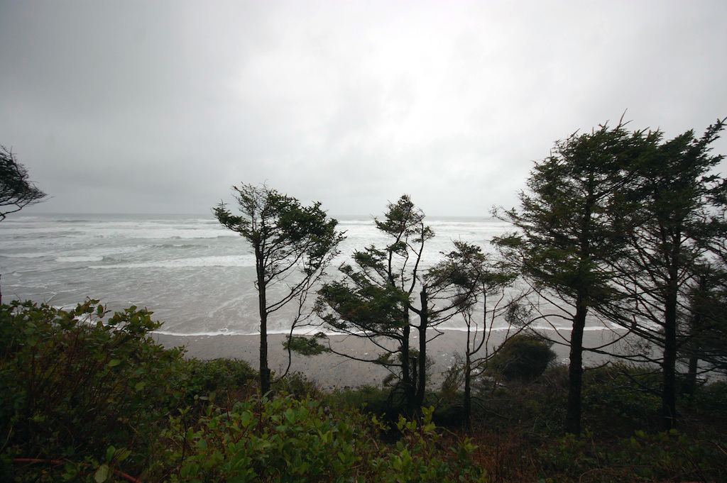
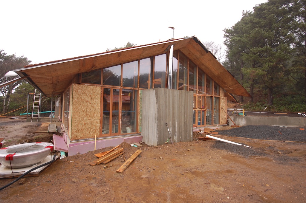
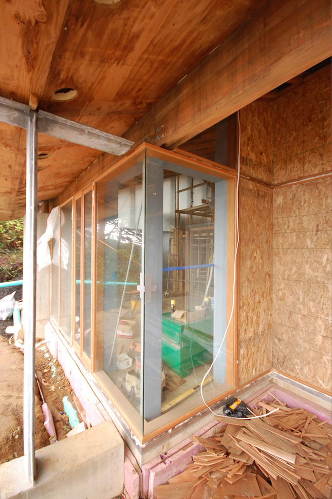
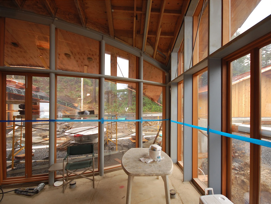
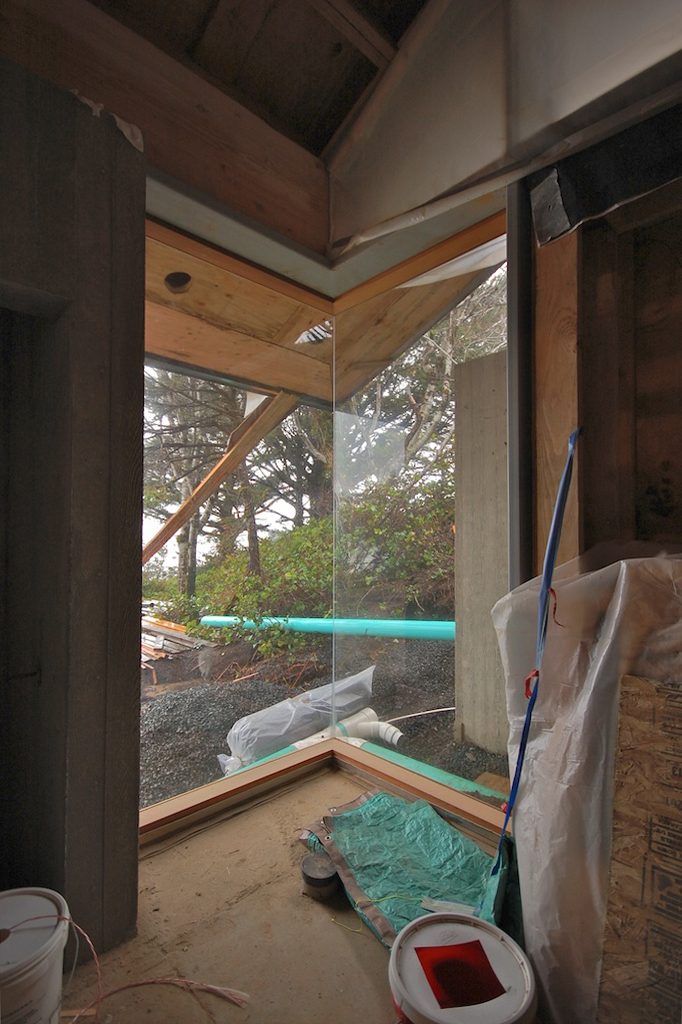
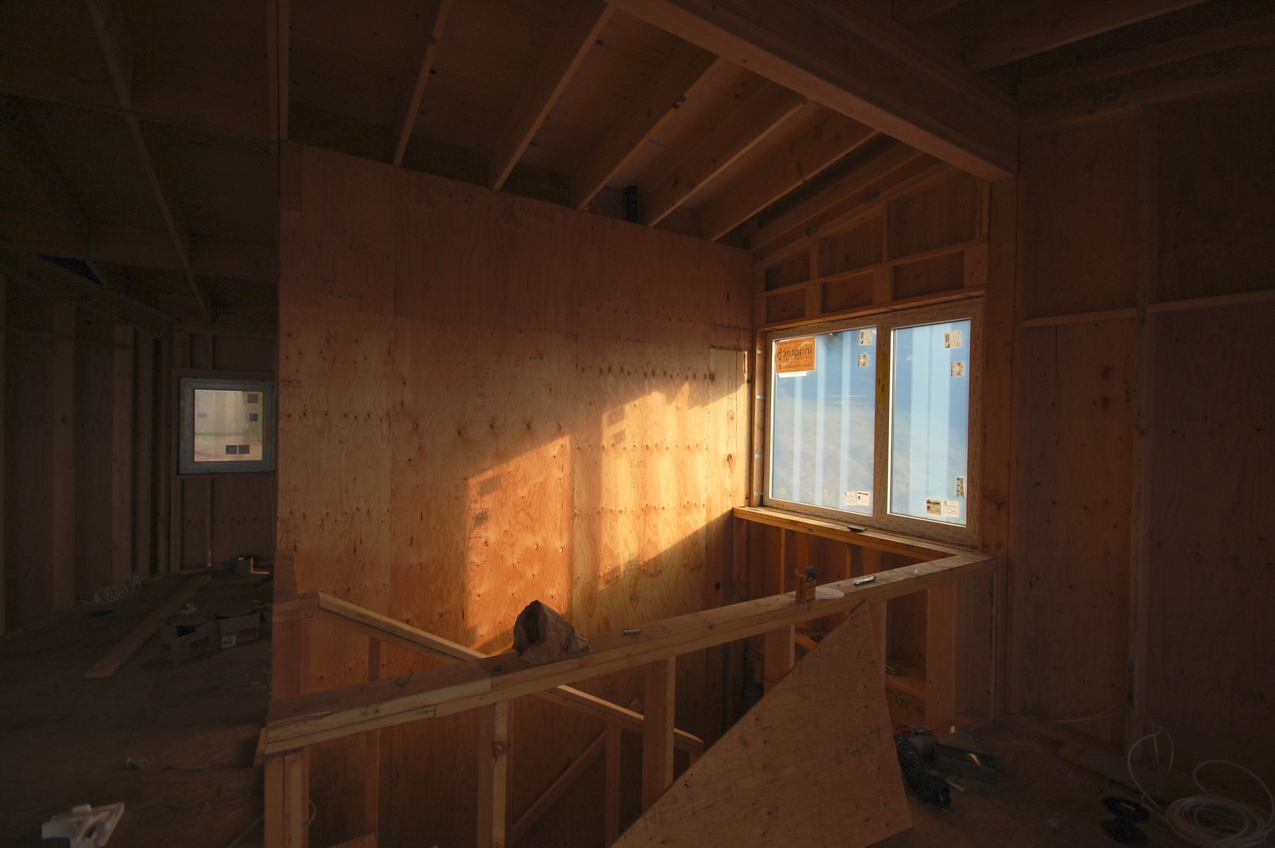
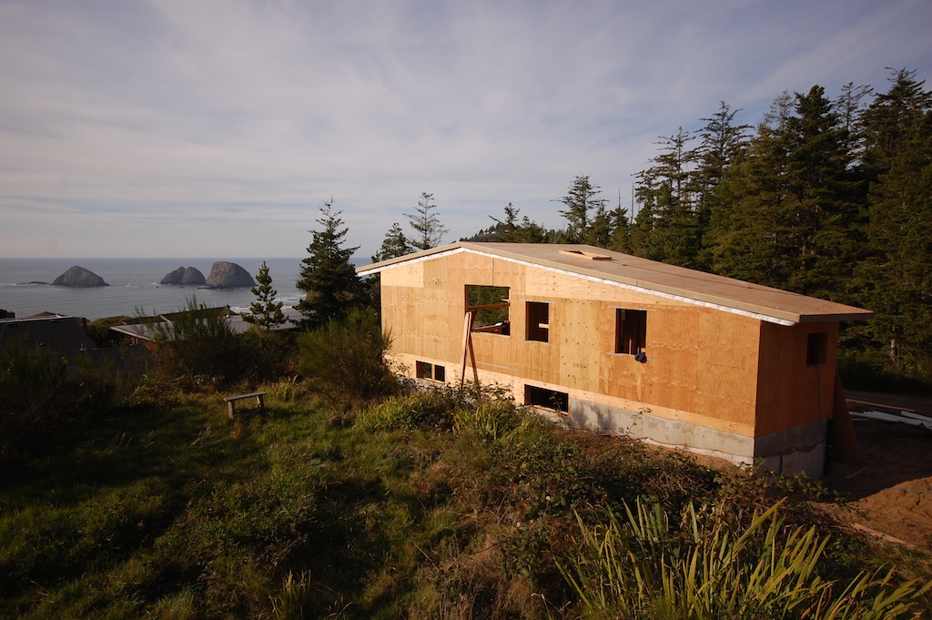
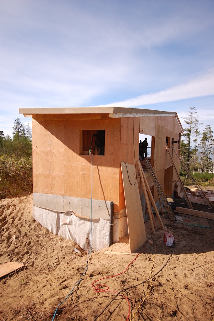
we made a quick visit to oceanside to check in on the construction progress over the last few months. the owners are doing most of the work themselves, and they've been moving along steadily on the interior. the spaces are starting to take shape, colors are getting introduced, and this little beach house is starting to come to life.
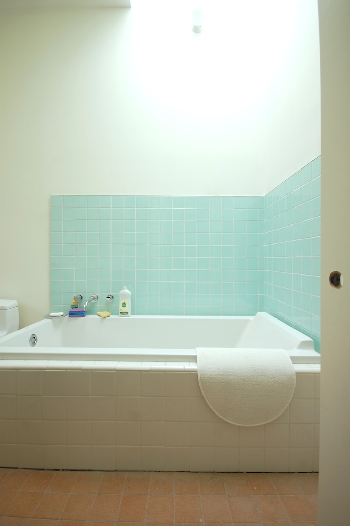
small project update
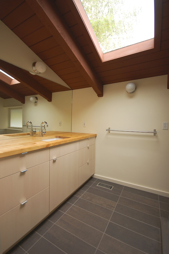
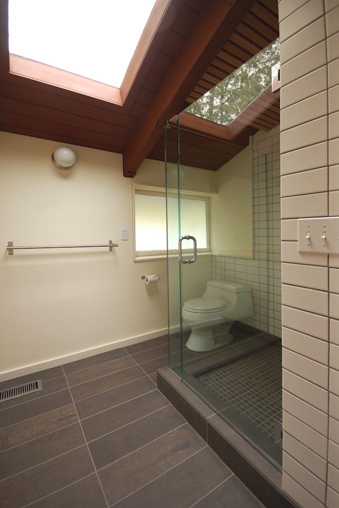
we recently shared some drawings and photos of a small bathroom remodel inspired by the japanese bath house. the work is complete and it turned out quite nicely (thanks to right arm construction). here are some photos of the completed project:

a quick reminder of what it once was.
cottage or castle?
we recently had a look around a new oceanfront compound under construction south of cannon beach.

design by eddie jones of jones studio.
construction by don tankersley.
preconstruction assistance by in situ architecture.
a break from the rain
yesterday we took advantage of the recent stretch of dry weather to visit our project under construction at the coast.

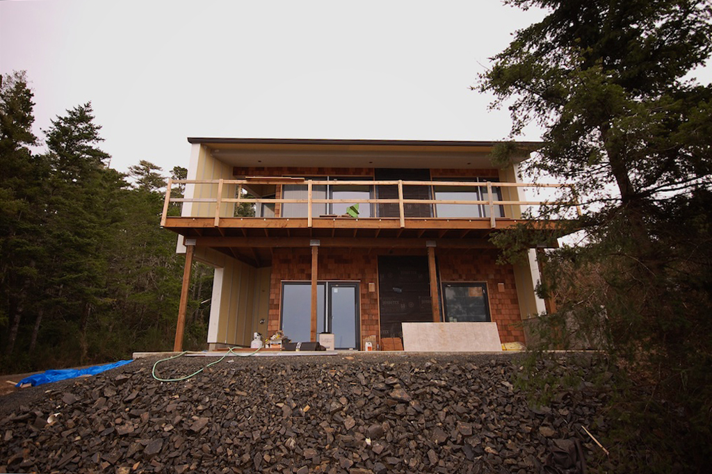
the exterior siding is installed and awaits a few final details and paint. the body and trim will be painted a dark warm grey and should recede nicely into the landscape.
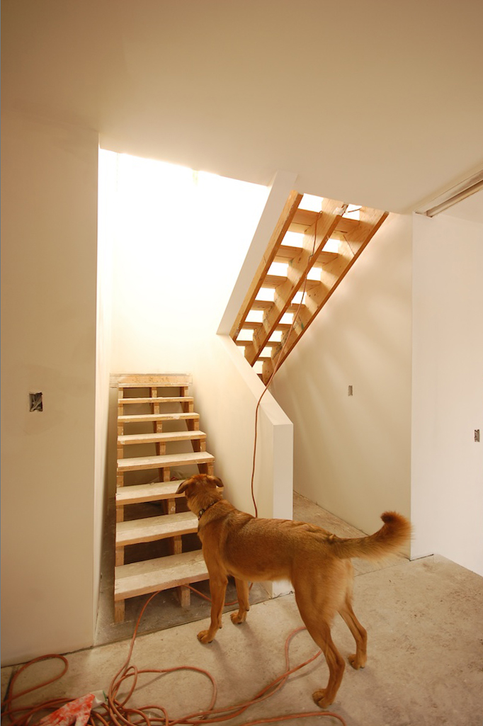
the open stair is flooded with south light and draws you up from the entry into the main volume of the house.
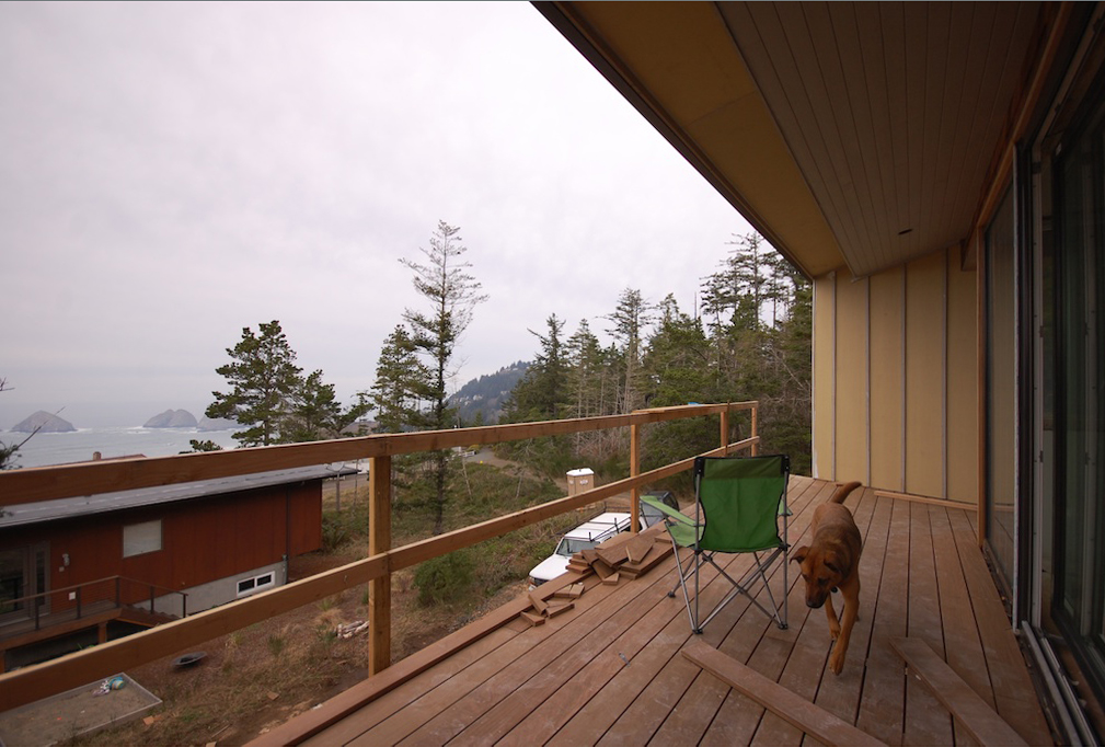
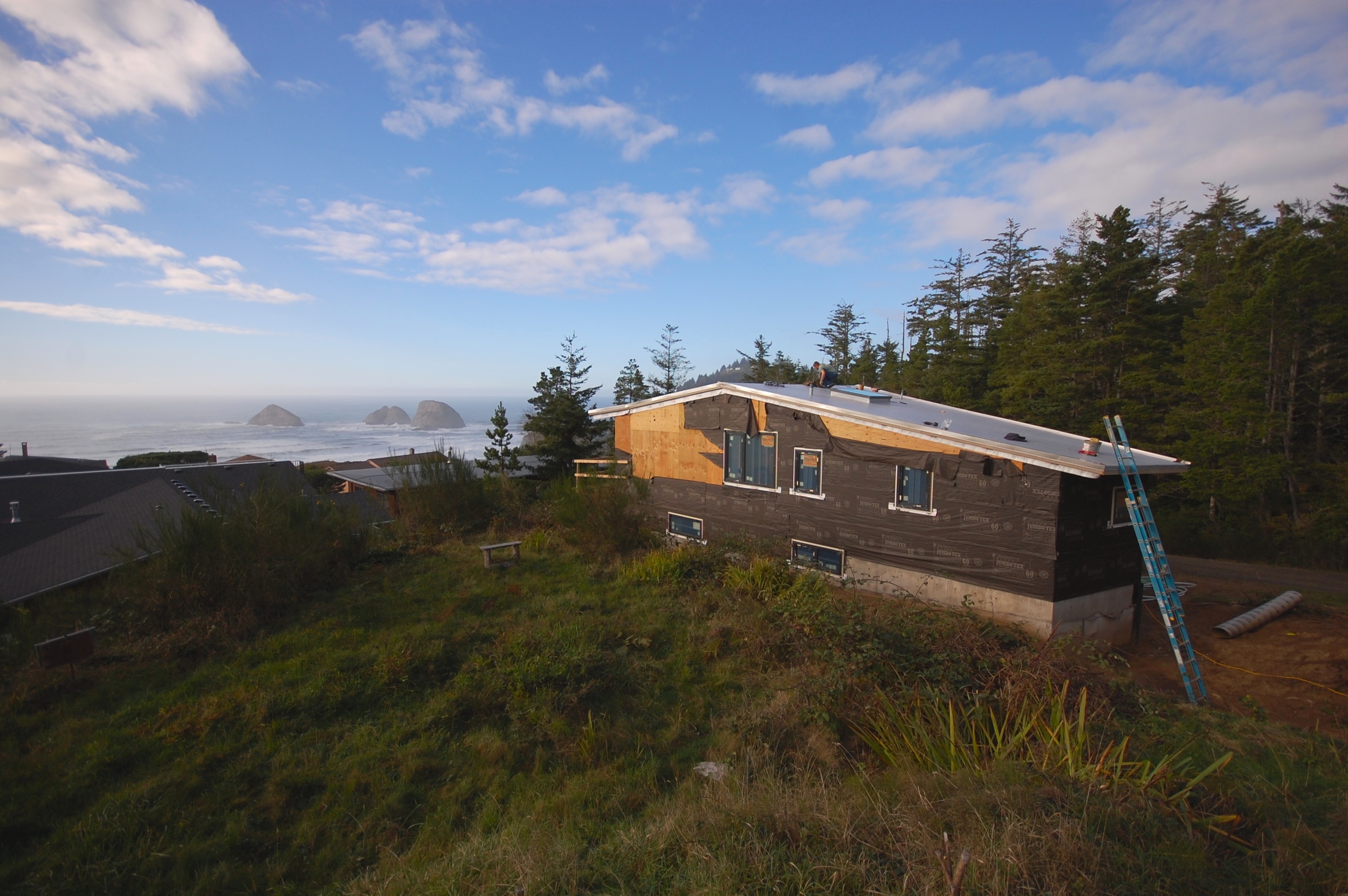
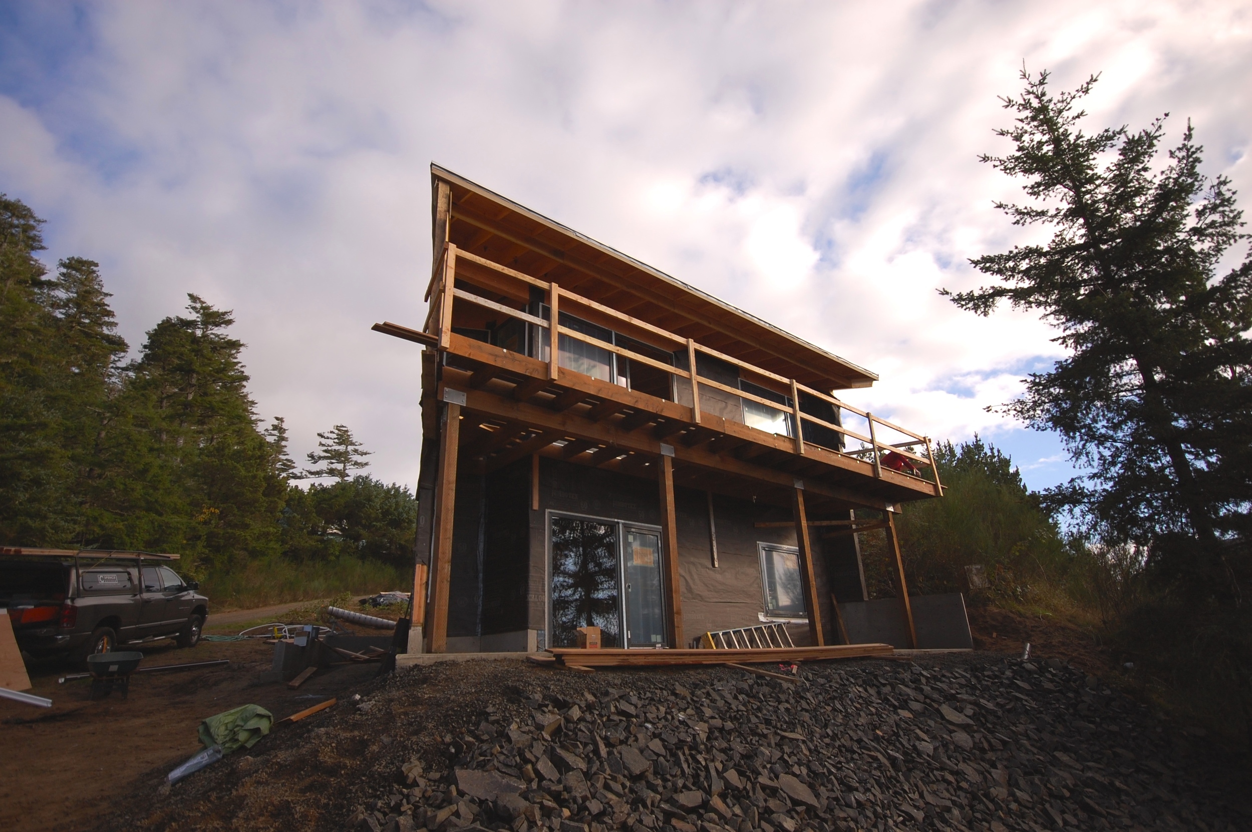
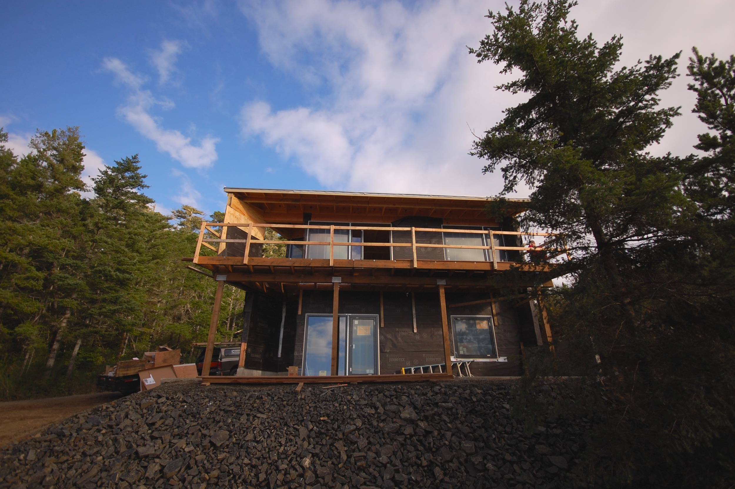
the spectacular view to the west required a nice long deck to take it all in after a hard day of playing on the beach (insert drink in hand).
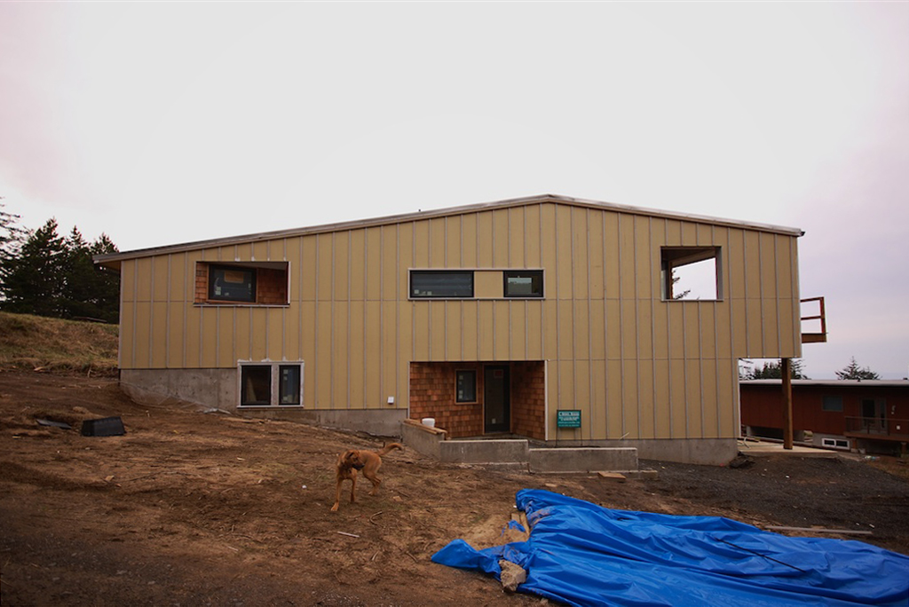
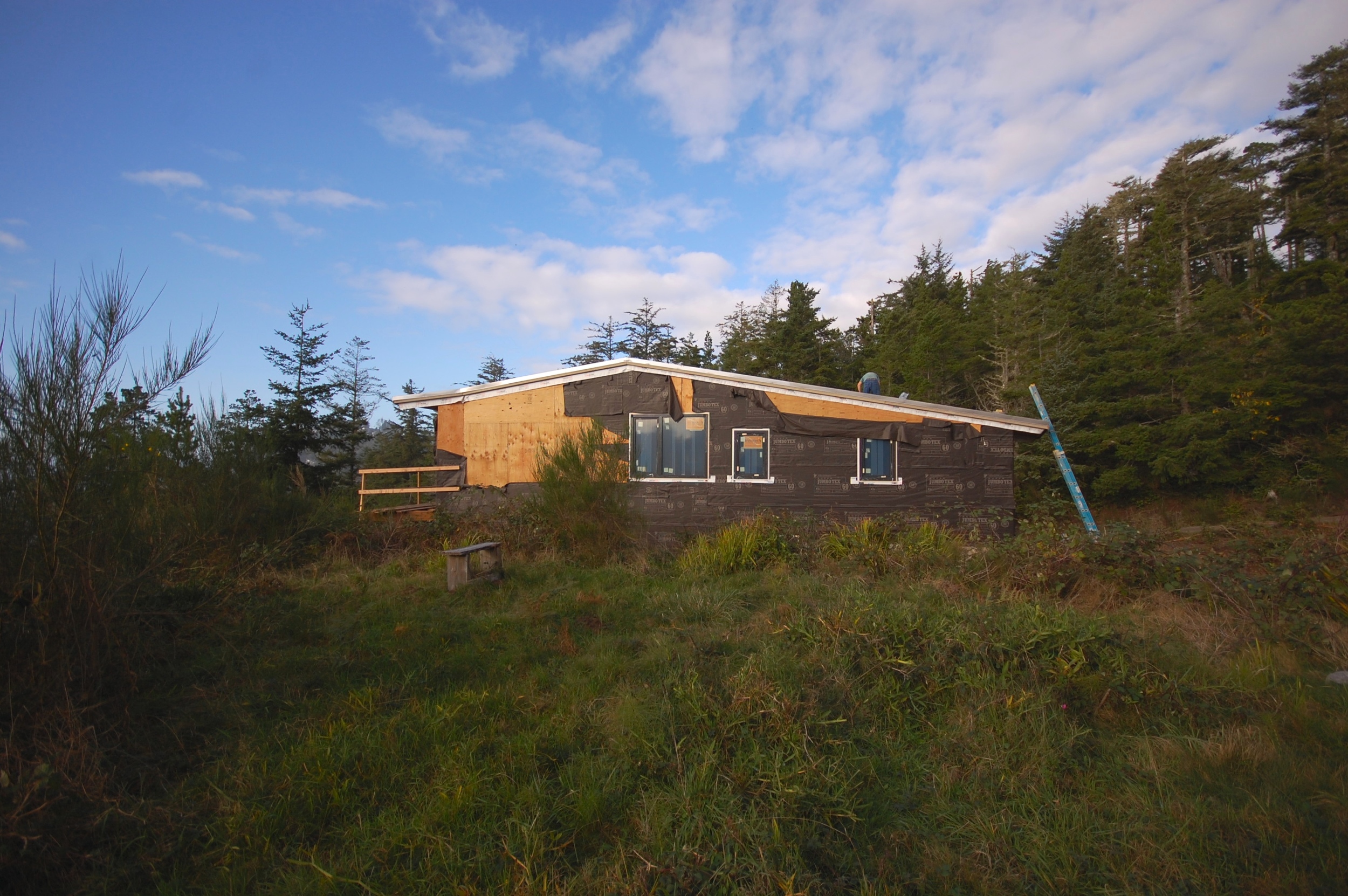
the tiny east elevation.
the cozy bedroom tucked into the east end.
the future 3-star ping pong room on the lower level.
a small taste of the main living room - more on this space later.
the bathroom with soaking tub and skylight above.
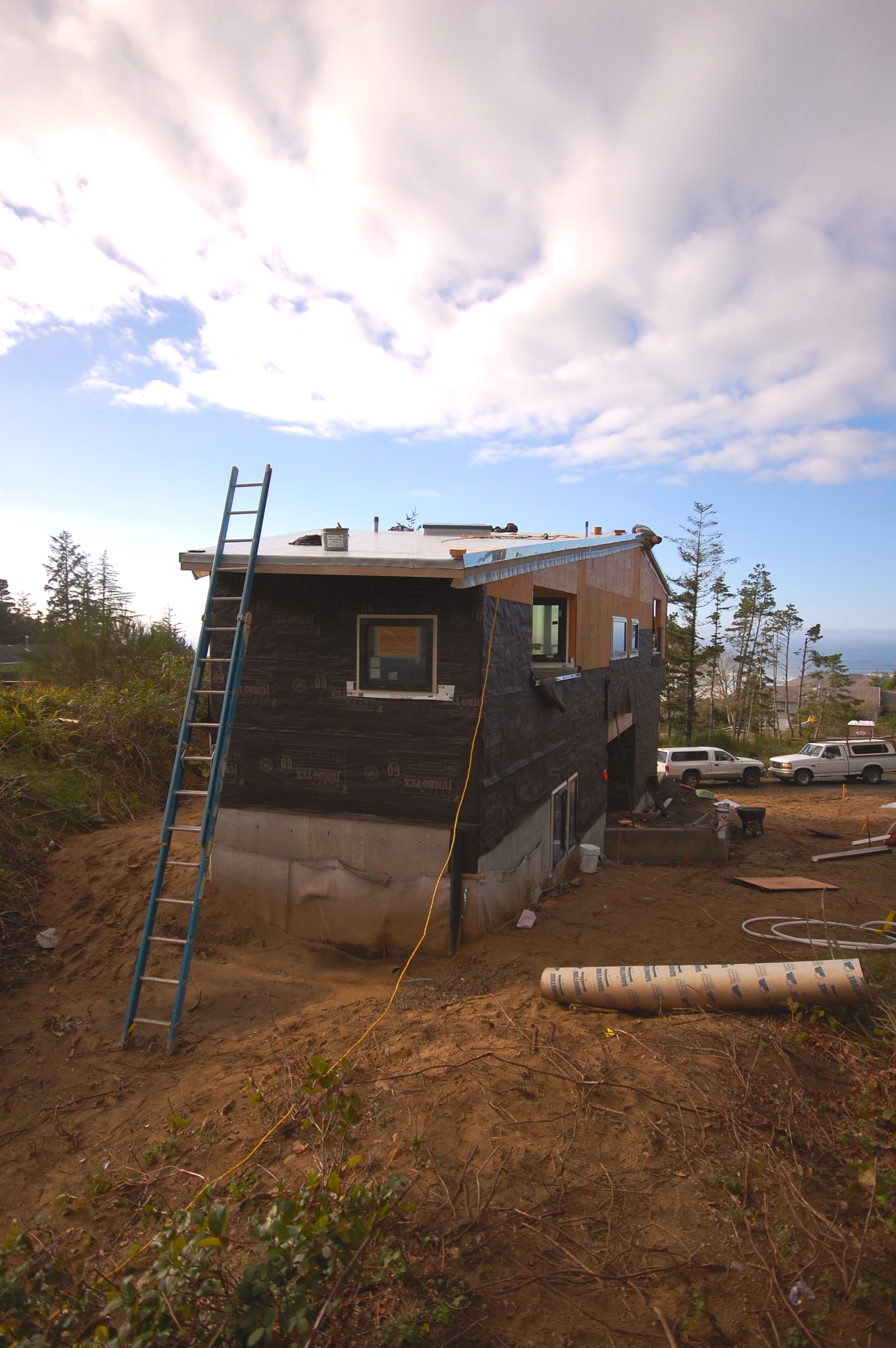
the west elevation in its partially finished state.
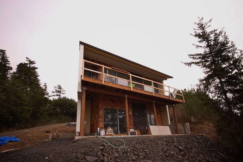
the north entry elevation from the road.
for more on the construction process so far, see the previous posts here, here, and here.
for more on the design, see the previous posts here and here.
context
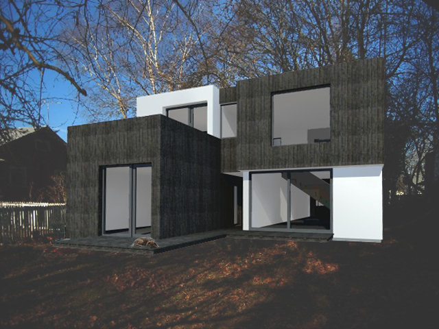
the software is free and the skills are rudimentary. but i still enjoy seeing some context.
more after the break.
small project update
we recently completed work on a small bathroom remodel with some pleasing results.

the existing dropped sheetrock ceiling was removed to expose the original wood decking. a carbonized bamboo cabinet provides a nice complement to the wood ceiling.
the existing shower compartment was replaced with a curbless all glass shower surround outfitted with a linear slot drain.
a duravit wall hung dual flush toilet is mounted on a background of simple white 3x6 tile in a stacked bond pattern.
a linear glass tile backsplash above the white quart countertop provides a hint of color. trimless mirrored doors conceal a wall to wall medicine cabinet.
linear porcelain tile provides a beautiful cost effective floor. a perimeter soffit conceals new piping and accommodates uplighting.
another bathroom remodel project is in the works. check back soon for the next small project update.
beach house skin
beach house continues
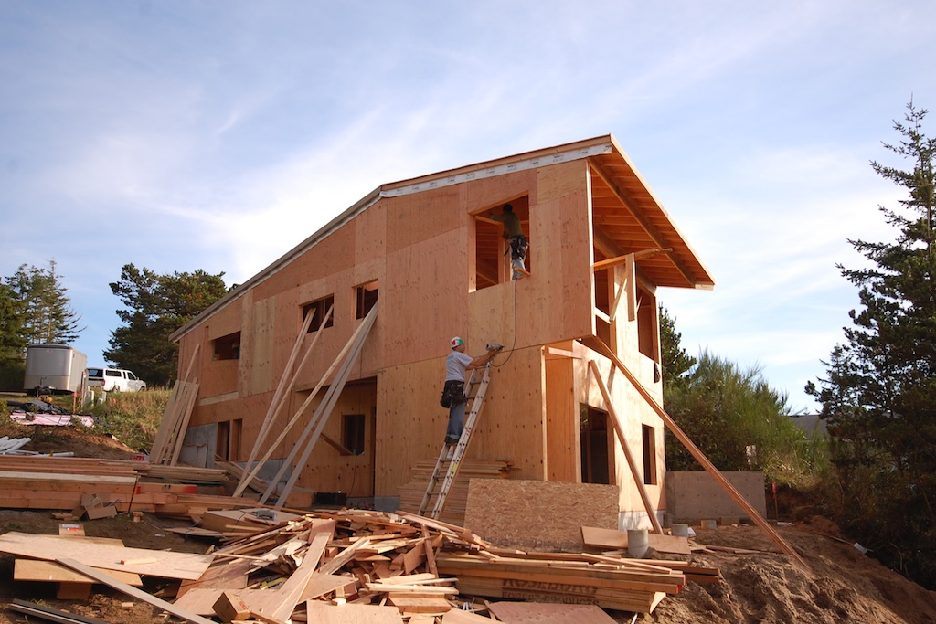
roof is on. windows are in. framing is up. decking is down. pictures are here:
pondering passivhaus
we're planning a passivhaus. in this country called a passive house. super energy efficient. it's a german system. it's pretty rigorous. there are a few built, a few more under construction. even more being planned. the concept is to create a house that is comfortable year round without a traditional heating system. it pretty much heats itself. heat from the sun, people, appliances, animals, etc. probably a small electric heater or two to supplement.
how do you do it? create a super insulated building envelope. make it super tight. maximize the solar gain. use incredibly efficient windows. minimize the losses. use mechanical ventilation and recover the heat. that's pretty much it. seems simple in concept.
we already have a site. it pretty close in. we like the neighborhood. it has great south exposure. opportunity for a garden.
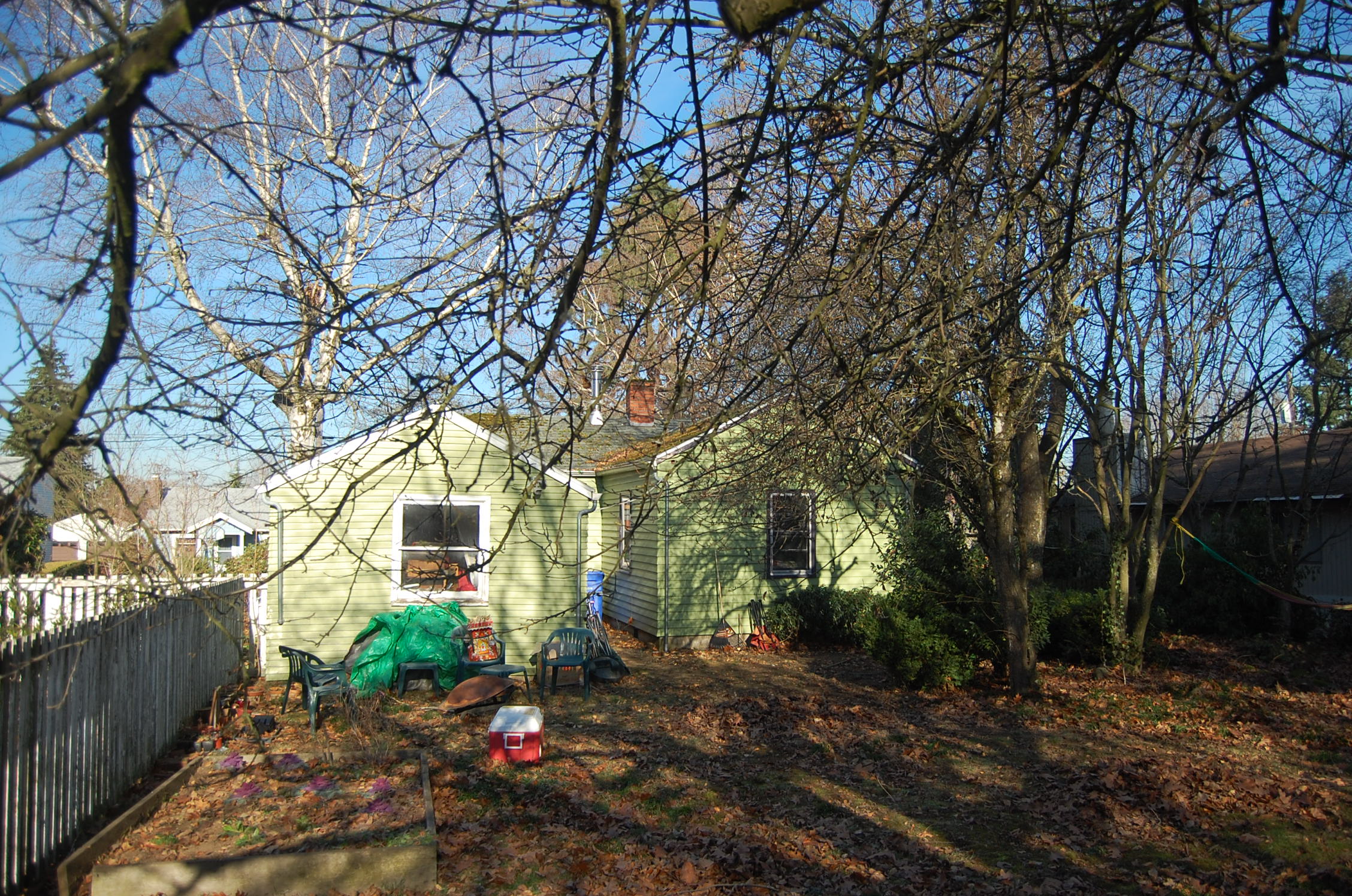
the existing house is very small (not a bad thing), but in not such good shape. it's barely insulated. the windows are rotting. some glass is cracked. the rooms are oriented all wrong. we think it's time for a change. passive house is our future.
here's what it looks like now:
come back soon and i'll show you more. details. drawings. models. maybe some calcs.
it'll be a struggle, but we're up for the challenge.
site visit
construction update
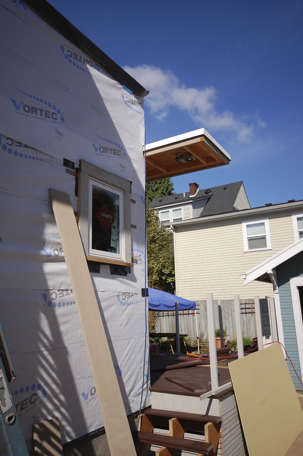
rainscreen installation
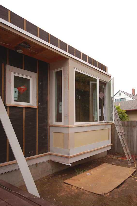
open joint cedar rainscreen siding aligns with existing lap siding
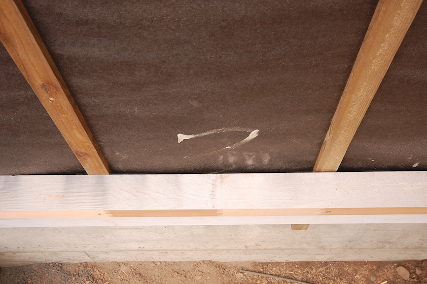
building paper for color only installed over air infiltration barrier
battens run behind belly band to maintain continuous airspace
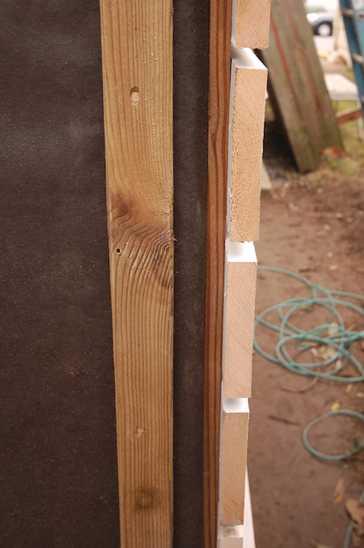
view of battens and siding at corner in preparation for butt joint
pre-primed rough sawn cedar siding with open joints
closed cell spray foam against underside of roof deck
previous entries on this project:
construction progress
fading summer
under construction
framing is underway for a new single story addition to a 1908 four square home in northeast portland.

the new addition will feature 8' tall full lite doors opening onto a new deck, a cantilevered bay with windows on 3 sides, an open joint rainscreen siding system, and an extensive green roof.
construction is expected to be complete by the end of the year. more progress photos to come.
hill houses
a look at a few houses built along fairmount boulevard, and how they maneuver the slope.
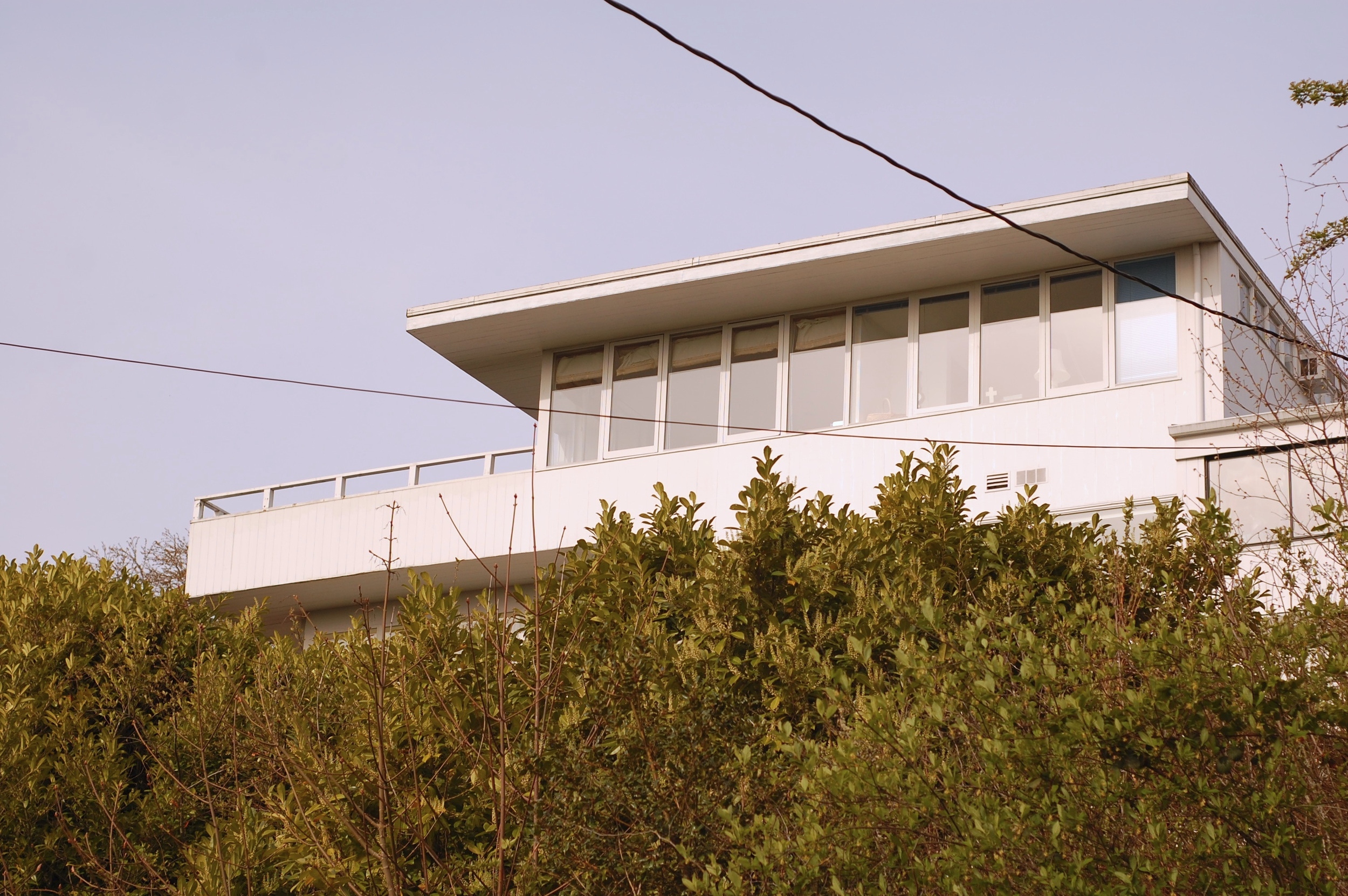
i love this simple elevation. architect unknown.
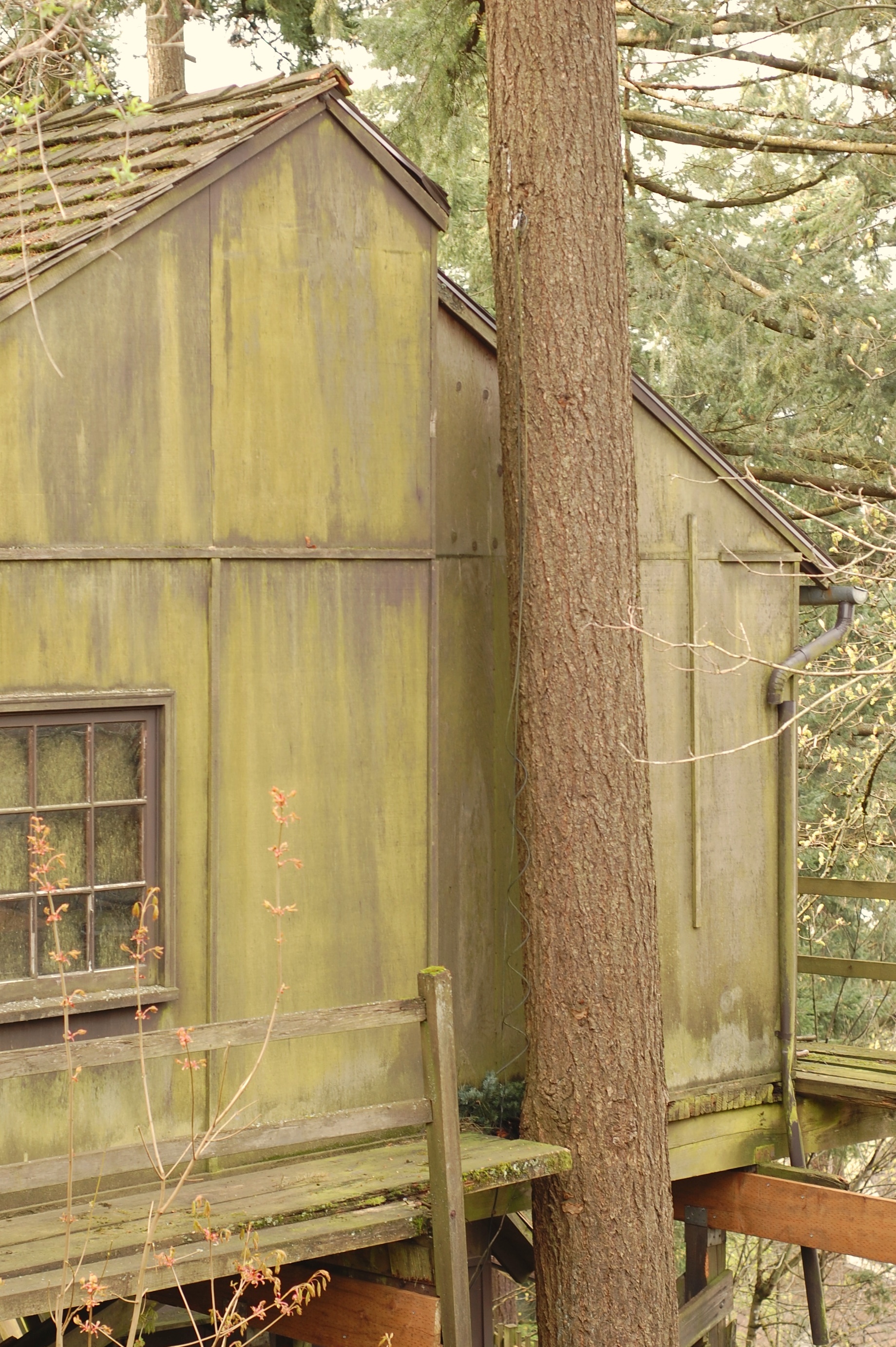
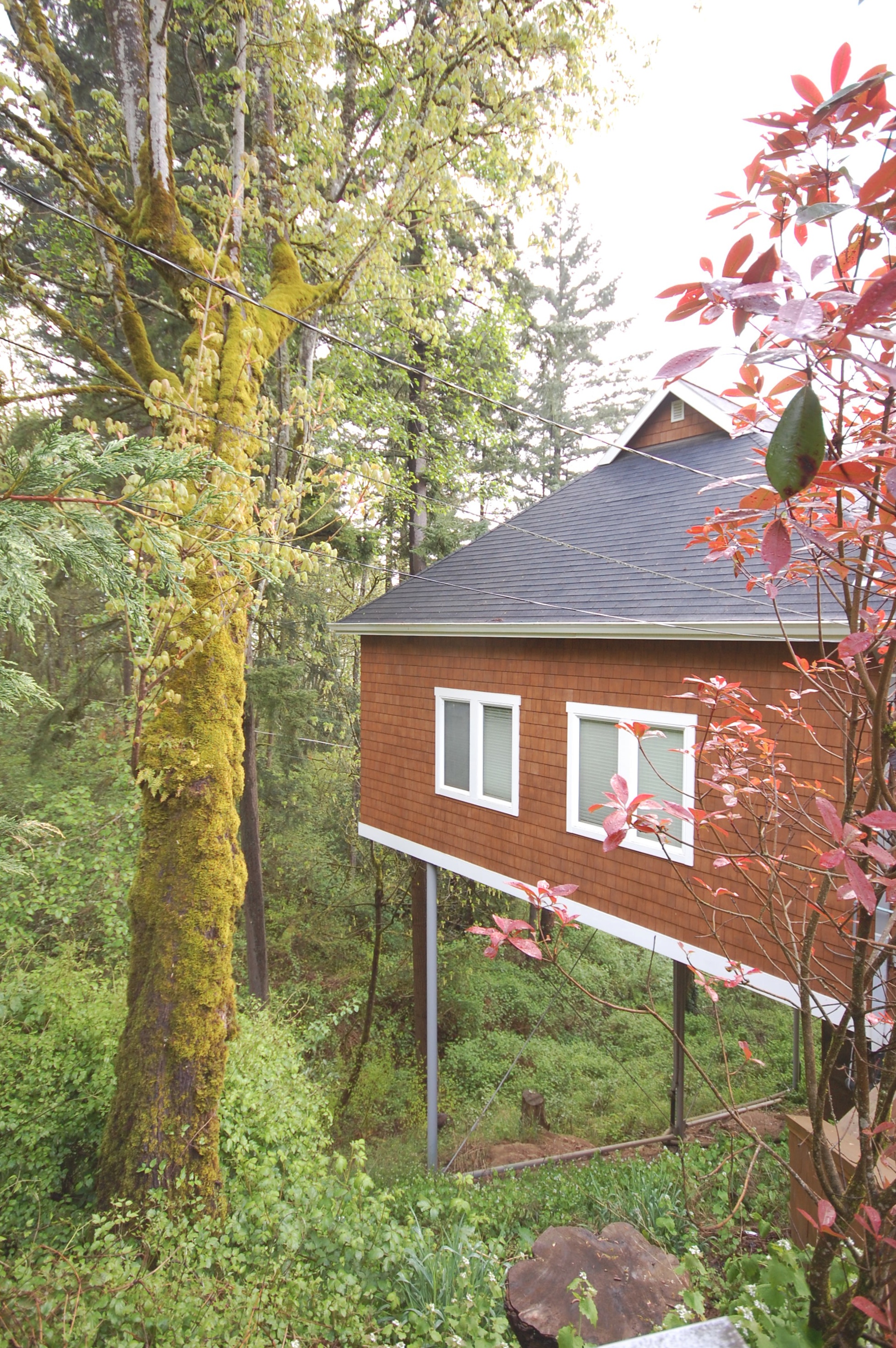
one of the few houses on the down slope that is built on grade. this house nestles into the hill beautifully and has a notch in the roof to allow the tree to grow through right at the building wall.
the detached garage for the same house is also notched to allow for a tree.
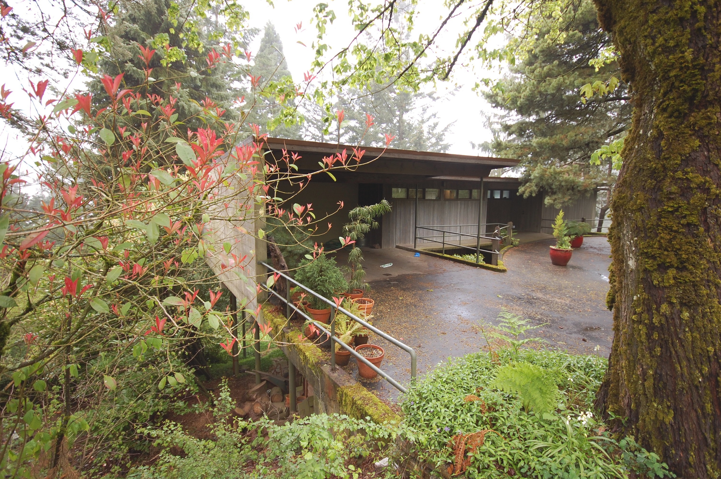
will martin architect. simple and timeless in a 70's way.
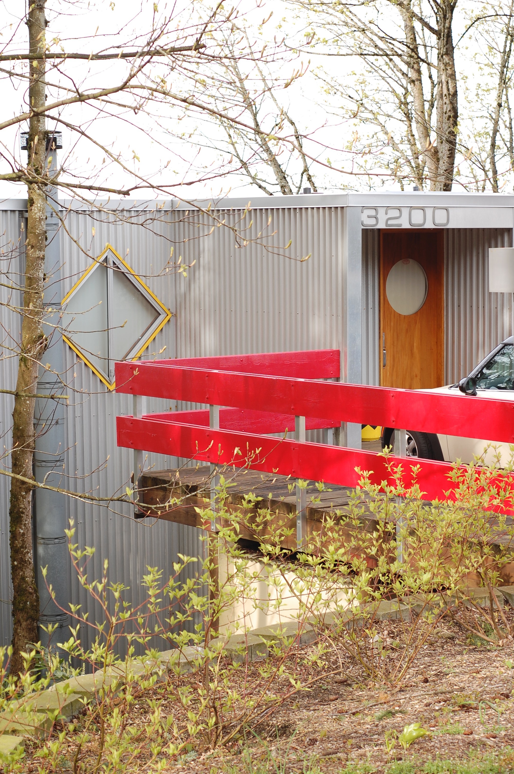
green metal barn on stilts.
parking the car is a huge challenge on these sloping sites.
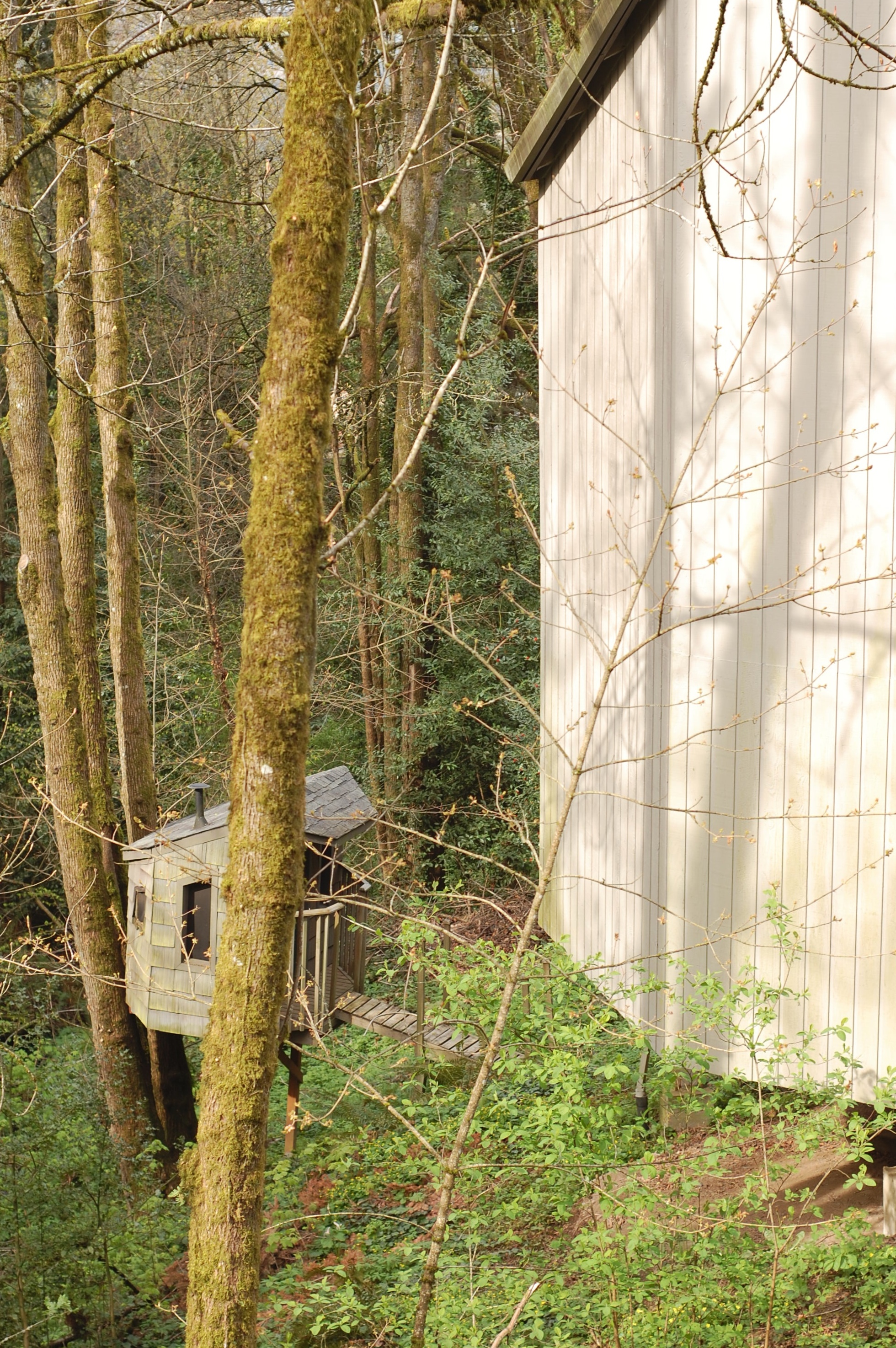
big house and mini-house.
it's as if they forgot they were building on a slope...
van evera bailey architect showing how to do it.
frankfurt kitchen
Just after the first WW, Enrnst May, Frankfurt's city architect initiated an ambitious project to house millions of soldiers returning to Germany, as well as thousands of war widows. May brought into his office a young but experienced Viennese architect, Grete Schütte-Lihotzky, to design a modern, rational, work kitchen.
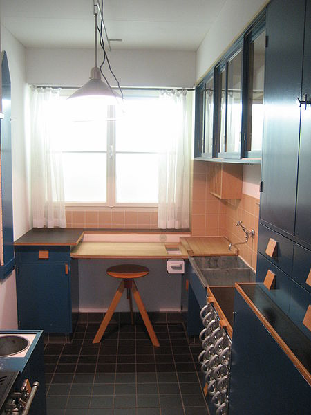
frankfurt kitchen | 1927 | grete schütte-lihotzky
The kitchen's organizing principle is similar to that of the design of galleys in ships and trains of the era. Its tiny size reflected a desire for efficiency and to save room for the living spaces of the flat.
frankfurt kitchen | 1927 | grete schütte-lihotzky
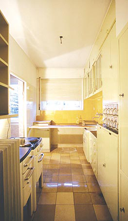
The kitchen's innovative features included continuous work surfaces, a table for preparing food under a large window, storage bins with handles and spouts, an adjustable ceiling light, a movable stool, a concealed pass-through, drop-down ironing board, and cabinetry painted a deep blue to naturally repel flies.
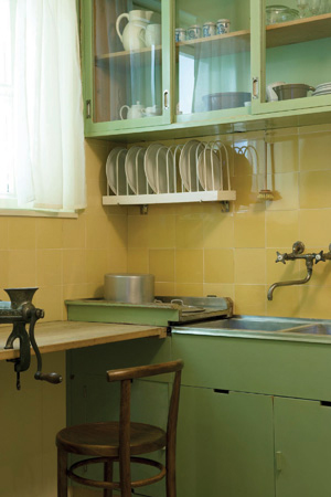
frankfurt kitchen reconstruction | 1990 | MAK vienna
Lihotsky apparently drew endless diagrams of how cooks move in a kitchen to understand how to maximize efficiency. The surfaces are at sitting height, so the cook didn't have to be on her feet the whole time.
frankfurt kitchen reconstruction | 2006 | v+a museum
Probably the biggest innovation was to take the dining table out of the kitchen. This simple galley working kitchen satisfied the modernists' concern with hygiene and made for a more efficient floorplan.
frankfurt kitchen reconstruction | 2006 | v+a museum
Not only was the layout of the kitchen innovative, but so was its construction and affordability. The cabinets were made without sides and backs to save cost, and special loans were made available to allow residents to buy a kitchen and pay it off with the monthly rent.
aluminum drawer detail
Over 10,000 versions of the frankfurt kitchen were installed within a four-year period. This small efficient kitchen became a standard in Europe throughout the 20th century.
in situ prior to dismantle and reconstruction
[youtube=http://www.youtube.com/watch?v=cbV5tUWhpGg]
thanks patrick
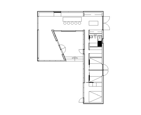
coastal 2
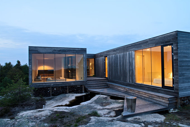
second iteration of new beach house in oceanside, oregon. more images and details to come soon.


